Design/Build: High Design Hopes
These clients wanted a lot for their dream home—literally and figuratively. The couple had been looking for a specific type of lot with a south-facing, flat backyard abutting a creek and ringed by old-growth trees. Their expectations also included private living spaces indoors and out while maximizing sight lines to the verdant yard.
Jeff Nicholson, principal architect and founder of Quartersawn, a Minneapolis-based design/build firm, knew his clients were serious about their expectations because they’d already parted ways with another architect.
Photo: Andrea Rugg Photography
“We spent more time on 3D modeling with them than on any other project,” Nicholson says, chuckling. “These clients are passionate about design and so we kept meeting with them to help them refine all of their ideas, but also used the modeling to show them how elegant the concept of ‘less is more’ can look.”
Nicholson’s design/build approach also helped bridge the gap between approving a design and selecting the actual materials to achieve it. He enlists his entire team—project manager, field superintendent, and designer—to participate in client meetings from beginning to end.
Photo: Farm Kid Studios
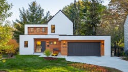
In this project, for example, the clients knew they wanted warm wood accents to balance a mostly white palette. The team gave them a 3-foot-by-8-foot sample of stained, sealed cedar in a groove shiplap assembly. “It allowed them to make sure it had the feel and look they wanted,” Nicholson says.
Stucco covers the rest of the modern exterior, punctuated by black trim outlining windows and rooflines, including a striking center gable. “We wrapped the stucco around the wood and offset the front door to pull people into the center of the house,” Nicholson says. “And projecting the stucco boxes around the wood-wrapped door and the windows gives a feeling of protection.”
Photo: Farm Kid Studios
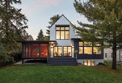
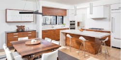
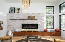
Walking through the entry, the owners and their guests glimpse views into the wooded backyard as they pass through a hallway that bisects two guest rooms and culminates in an expansive, open living, dining, kitchen space. The lot widens as it nears the creek, which allowed Nicholson to angle the living room to maximize views and add square footage. The lot’s unusual shape also afforded the opportunity to set the screened porch—the clients’ highest priority programmatically—on the corner opposite the living room.
How do you have a screened porch in Minnesota that doesn’t block the views in winter but takes advantage of them when the season makes the porch usable? “The wedge shape let us set the porch off to the side,” Nicholson says, “while letting most rooms, even the stairwell and basement, benefit from southern light.”
Project: Modern Tudor
Architect/Builder: Quartersawn, Minneapolis
\Shelley D. Hutchins writes about residential construction, design, and sustainable building.
About the Author
Shelley Hutchins
Shelley D. Hutchins writes about residential construction, design, and sustainable building.


