Two Great Waterfront Getaways
Properties with superb water views come at a price. Building a home on the coast, especially the barrier islands off South Carolina, means enhancing its resistance to big waves and hurricane-force winds.
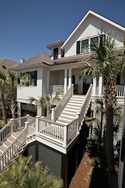
The home in Isle of Palms, S.C., pictured here is right on the ocean and also located in a flood plain. “We get the brunt of the wind and water,” says Phillip Smith, principal of Phillip W. Smith General Contractor in Isle of Palms. “The challenge is to comply with requirements for added structural integrity, making sure the home will still be standing after a hurricane.”
In addition, Smith has to protect the exterior against the damaging salt-air environment. “Salt has no friends; it eats everything,” he says. “Picking the right products is very, very important.” He prefers materials such as copper roofing and flashing, stainless steel hardware, ipe wood for decks, and synthetic trim.
The other featured home on Lake Travis in Austin, Texas, is, coincidentally, also in a flood plain. Austin builder Tommy Burt had to elevate the home without making it look like it was on stilts, and cope with noise and work-hour restrictions.
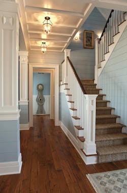
A blue color palette, oak flooring with a French bleed, and crisp white trim unify the interior of this home in Isle of Palms, S.C., and achieve the desired coastal feel. (Photos: Warren Lieb).
Worth the wait
The owners of the South Carolina home live full time in Missouri and had been vacationing in Isle of Palms for about 15 years when a stunning oceanfront site became available. They snapped up the property and contacted architect Stephen Herlong to design their East Coast getaway. Herlong, owner and principal of Herlong & Associates, Sullivan’s Island, S.C., says the clients were looking for a unique home with comfortable outdoor living spaces.
Right from the start, the builder and architect had to comply with myriad regulations and restrictions. The property is in an ecologically sensitive area on an inlet between islands. It’s also in an extreme flood zone. “We had to raise the house quite high off grade (15 feet, 9 inches at the first floor) to meet FEMA flood requirements,” Herlong says. He obtained a design variance to build a structure that is 47 feet high at the roofline.
The home has a total of 5,400 square feet of living space. The first floor has his-and-her home offices, a master suite and the primary living areas, plus an extensive system of porches and decks. Two guest suites, a den, and a bunkroom for the grandchildren are on the second floor.
The resort community in which the home is located has a review board that imposes tight restrictions on new construction. “The board was very interested in how we were going to handle the architecture on the street side,” says Herlong. “We stepped down the plan to bring the house as close to the ground as possible while meeting the elevation requirements.”
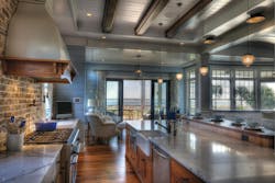
Different ceiling and wall treatments define the rooms. For instance, the back wall of the kitchen is covered in brick, while the coffered ceiling features decorative wood beams.
For the exterior, builder Phillip Smith selected pressure-treated pine lap siding and hand-split cedar shingles. “It’s really important to prime the wood on all four sides as well as on the cut ends,” Smith says. “If the ends of the boards aren’t primed, they’re 200 percent more likely to absorb moisture than the face of the wood. It’s beneficial a thousand times over to spend the extra time and money to prime the wood on all six sides before we put it up. The boards won’t crack, cup or move.” He often puts a finish coat on the wood before installation.
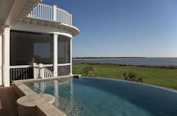
To complement the contemporary coastal feel of the home, Herlong designed it with open interior spaces that don’t block ocean views. The outer wall facing the ocean is slightly curved to help focus the house toward those views. “It’s a fun detail that opens the house up and connects it even more to the outdoors,” he says.
The disappearing-edge pool had to be elevated 20 inches above the deck to comply with FEMA flood requirements.
Different wall and ceiling treatments define the rooms, but blue is a unifying color throughout the home. Oak flooring with a French bleed (a black accent finish at the edges of the planks) is also used to tie the main living areas together.
With this home, as with any custom-home project, Smith emphasizes the importance of assembling the right team. “There’s so much collaboration between the architect, engineer, designers, builder, trade contractors, and homeowner that it’s critical to the success of the project to pick a team that can work together well,” he says. “The outcome is easily accomplished when everybody’s on the same page.”
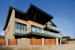
The home’s butterfly roof allowed architect John Hathaway to design the interior with 17-foot ceilings and large expanses of glass that maximize views of Lake Travis (Photos: Tre Dunham).
Float like a butterfly
This home on Austin’s Lake Travis started out as a vacation property that would be shared by two families. “That drove some of the design elements, namely two master suites on the first floor,” says architect John Hathaway of Vanguard Studio, Austin.
When the plans were nearly complete, however, one of the families decided to purchase an existing lake home instead. The new house, which is a total of 4,315 square feet, transitioned into a getaway for the other family.
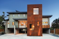
The property’s location in a 25-year flood plain necessitated raising the living area 10 feet above grade. Underneath the first floor is a large, open area for parking. A swimming pool was also built on grade.
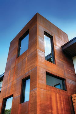
The stair tower at the front of this Lake Travis house is clad in raw steel panels that were allowed to rust and form a patina. Builder Burt-Watts Industries cleaned the panels thoroughly with a degreaser so they would rust evenly.
Hathaway says the clients wanted something contemporary, clean, and modern. “Because it’s a second home, they felt they could have a lot more fun and do some unique things.” Their vision included exposed concrete masonry unit (CMU) block and a lot of glass.
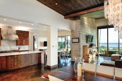
Burt-Watts Industries, Austin, built the exterior walls with concrete block and wood-framed the interior. “We don’t have CMU block everywhere, but we were able to work it into a lot of the main areas so it’s still visible, such as on the fireplace,” Hathaway says.
The master suites are at opposite ends of the first floor, with a large open space inbetween comprised of the kitchen, breakfast room, dining room, and family room. On the second floor are the children’s bedrooms and playroom. The outdoor living space runs across the entire back of the house to capture lake views.
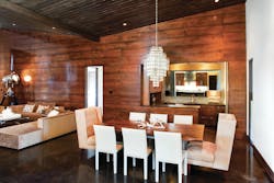
An alder wall with a transparent black wash adds warmth to the dining room and family room. Stained wood ceilings and fabrics like leather and wool also provide a contrast to concrete floors and exposed concrete blocks. The chandelier is made of seashells — yet another natural element.
Hathaway says one of the most noteworthy features is the butterfly roof, which instead of sloping down is low in the middle and swoops up on each side. The design gives the home 17-foot ceilings—perfect for large picture windows at the highest points—and visually divides the dining and family rooms. “It really opens up the windows higher in the back, kind of like opening an eyelid to the lake view,” he says. Deep overhangs keep the interior of the home from overheating due to the intense Texas sun.
Wood on the ceiling and one entire wall of the family room helps warm up the living areas. “That was Ron [Malott’s] idea,” says Hathaway. Malott, of Ron Malott Interior Design, Austin, originally wanted to use walnut for the family-room wall, but it was cost prohibitive, so he chose alder instead. The clients did, however, indulge in a walnut slab dining-room table. “It’s very cool and naturalistic and plays well off all the hard lines,” he says.
Builder Burt-Watts Industries made the retractable wall at the rear of the house out of fabricated steel. The doors are 12 feet high and fitted with commercial-grade, double-insulated glass.
The CMU block walls provide increased insulating value. “They’re double block walls with insulation between the two layers,” he says. “The R-value is somewhere in the upper 30s, compared to most homes whose walls are R-19 or R-20.”
Burt-Watts is a commercial contractor that has completed a handful of residential projects. This home was built for a friend and client of company president Tommy Burt. “We helped them with a pool house and guest house renovation on their primary residence, which is why they wanted us to do the lake house,” Burt says.
The close proximity of neighboring houses imposed noise restrictions and work-hour restrictions on the builder. Working with concrete-block walls was also tricky, says Burt, because “anything you’d put in that wall had to be exact. It’s not like a Sheetrock wall where you can move electrical outlets later.”
Staying grounded
Phillip Smith has been building houses on South Carolina’s barrier islands for 23 years. To give his homes added structural integrity in a region where violent storms are common, Smith uses beefed-up steel framing, additional hurricane tie-downs, and shear walls that are braced and reinforced to withstand high winds. Windows with impact-resistant glass are an absolute must.
“It adds a lot of work and a lot of cost, but it also has a lot of benefits for the homeowner,” says Smith.
In that area, it’s typical to build oceanfront homes (or homes located in velocity zones) on pilings. The Isle of Palms residence featured in this article is in a flood plain and sits on pilings that are about 25 feet deep. “We drove them into the ground and tied them in with a grade beam,” says architect Stephen Herlong says. “Reinforced piers follow the grade beam up to the level of the first-floor beams.”
Because it’s located in a flood plain, the home had to be elevated 10 feet above grade. The open area underneath is used for parking.
The Lake Travis home is also in a flood plain and therefore secured with concrete piers and columns. “The first floor is a structural steel slab with wood floor joists,” says builder Tommy Burt. Architect John Hathaway notes, “The biggest challenge was finding a way to [elevate the house] and still make it look good, not like a house on stilts. So instead of columns there are big CMU block walls on the sides. They have some openings, but read more as walls. I think we did a good job of making the house feel like it was well connected to the ground and had a lot of mass.”
