Home Design: A Mellower Modern
True or not, modern design is described by many as cold, characterized by relentless straight lines and hard, shiny surfaces. To satisfy desires for a more inviting kind of
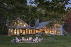
contemporary, designers and builders are responding with a modern-rustic style. Homes fit the local vernacular and are sited to take best advantage of their surrounding landscapes, with large windows and easy access to the outdoors. Interior design incorporates natural elements and finishes with varied textures to create a comfortable, lived-in feeling. The following three projects, all winners of the annual Marvin Architects Challenge design competition, provide examples of this warmer modernism.
Capturing the Camp Spirit
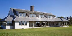
Each summer for many years, architect Jacob Albert’s clients rented an apartment in a 100-year-old waterfront camp on the Massachusetts coast. When the property next door came up for sale, they purchased it with the intent of building their own camp-style home. “They wanted to capture the spirit of the informal and rustic house they’d rented,” Albert says.
Because the site is on the water, it is heavily regulated, and so Albert decided to stay within the footprint of the existing dilapidated house that would be razed. “Our challenge was to unite the given shape of the footprint with a feeling of the old camp, called ‘Big Camp,’ next door,” he says.
To create the camp style, Albert designed “a thin construction with a gabled roof and a porch supported by tree trunks,” he says. The shingled house, made of Alaskan yellow cedar, is reminiscent of other local turn-of-the-century homes. “It will turn a silvery gray as time goes on, and it’s a traditional color palette for the New England Coast,” Albert says. There’s a stone fireplace, abundant windows, exposed rafter tails, and a wood interior painted white.
According to builder Joe Chapman, VP of Doyle Construction, in West Tisbury, Mass., “There’s not one piece of drywall in that house. Not one.” His challenge was dealing with a house full of wood that he knew would swell and contract. “We had to line up the reveals [the joints between the boards],” he says, “which is made tougher by boards shrinking and swelling at different rates.” In some areas, such as the ceiling of an upstairs sunroom, he “masked” the eventual wood movement by placing vertical ribs on top of the horizontal boards. The ribs look like narrow, exposed rafters and create shadow lines that draw the eye away from possibly uneven reveals.
Chapman’s other challenge: perfecting the roof layout with its various pitches, which made it difficult to create nice and even exposed rafters. “Working it out was basically mathematics,” he says. The design all adds up and seamlessly fits in its place by the water.
Project Little Camp, Coastal Massachusetts
Architect Jacob Albert, AIA, Albert, Righter & Tittmann Architects, Boston
Builder Doyle Construction, West Tisbury, Mass.
Size House: 5,000 square feet; guest house: 900 square feet
Photographer Brian Vanden Brink
Out of Site
The challenge of building on rocky land was made easier by the homeowner’s earlier decision to “edit the landscape,” says architect Elizabeth Herrmann. The Brooklyn-based clients who own this property in the Vermont woods used it as a camping getaway for several years before finally building on it.
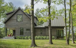
Burlington, Vt., landscape architecture firm Wagner Hodgson removed what was overgrown to reveal a parklike setting, Herrmann says. But the homeowners were “delicate over the removal of stuff,” she adds. “They didn’t want to regret chopping down a tree.” This, in turn, made it easy for Herrmann to react to the environment for the design of the home and come up with “something spare, with a nod to Vermont vernacular,” she says. “Because the site was already prepped, I just had to bring in the house.”
The exterior materials—stained cedar siding milled to have a pencil-size reveal, as well as low-key gray standing-seam metal roofing—fit quietly into the wooded lot. The cedar wraps all the way around the house. “We mitered the corners so it looks continuous,” Herrmann says. “The carpenter was a very patient man. Since he couldn’t stop and start up again, it had to all be done at once. Everything had to be level all the way around the house.”
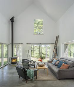
The serene landscape matched the couple’s desire for a clean, simple Scandinavian-influenced interior. To take advantage of the view and admit natural light, the kitchen has a large window and no upper cabinets, for a more open feel. A large pantry houses the refrigerator, small appliances, and some cabinets. The open floor plan maximizes views to the outdoors through large windows, which function like picture frames to compose particular vistas. In the living room, “some [windows] are pushing maximum glass size,” Herrmann says.
With simple design choices, such as a darker exterior leading to a lighter interior, and a low-ceilinged exterior entryway that opens into a dramatic, high-ceilinged living space, Herrmann imbued this unassuming home with drama and even some mystery.
Project Knoll House, Ripton, Vt.
Architect Elizabeth Herrmann, AIA, Elizabeth Herrmann Architecture + Design, Bristol, Vt.
Builder Northern Timbers Construction, East Middlebury, Vt.
Size 2,300 square feet
Photographer Jim Westphalen
Continuity of Character
The existing plywood-clad home was in remarkably good shape after 55 years of Maine shoreline weather. The homeowners—children of the original owner—wanted to restore and update while keeping the home’s rustic summer-home charm and adding a new space that could be used year-round.
Designed by local architect Cooper Milliken, the house was “cutting edge for the 1960s,” says William Hanley, coprincipal with Heli Mesiniemi at WMH Architects, in Northeast Harbor, Maine, who worked on the project. Set on piers, the original house was framed in native Maine pine, finished inside and out with fir plywood panels, and “organized in a 4-foot grid system that Cooper adhered to rigidly,” Hanley says.
Despite having the original documentation, WMH did extensive as-built drawings in ArchiCAD. “We essentially build the structure in detail and get to know it,” Hanley says. “Then we start to think about schematic design direction.” What they learned here helped to guide the direction, he says.
Hanley decided to resheathe the house, since the plywood shell had, he says, “danced with storms, and things had worked themselves apart.” The team had to tighten that up and improve the structure and rigidity, which they did with a rainscreen and 4-by-8 sheets of fiber-cement sheathing. Inside, another layer of plywood sheathing infill was introduced. That gave the homeowners the structural soundness they wanted, as well as continuity of character. The whole home is an open floor plan with a sleeping loft above and no floor-to-ceiling walls. The new construction, built on a frost-protected slab foundation, seamlessly merges with the original structure, thanks to a butterfly roof.
Marrying the two structures was a challenge, says Kevin Gresser, project manager at E.L. Shea Inc., in Ellsworth, Maine. “There’s a large cricket—a triangular shape [added] to make a high point in the middle of the valley to push water away,” Gresser says. “There also was a lot of sanding involved with the pine woodwork, which had yellowed with age, [requiring] staging and ladders and platforms to get to the highest spots.”
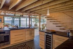
Setting the two staircases—one in the original house and one in the addition—also posed challenges. The clients wanted to be able to have as many unimpeded views of the water as possible. Replacing the original staircase with a harp stair accomplished that while incorporating additional matching architectural elements.
The stair treads are embedded in the wall and cantilever out, with support rods bolted to a piece of structural steel added to the existing wood frame in the older building. “It was time-consuming to build because it was so precise,” Gresser says.
In terms of sustainability, Hanley says, “the addition is 180 degrees beyond the existing house.” The owner says he used to stay at the house until the water in the toilets froze. Now he can retreat to the new addition and enjoy the home he’s known since boyhood all year-round. CB
Project Shorefront Camp, Trenton, Maine
Architect William M. Hanley, AIA, and Heli T. Mesiniemi, AIA, WMH Architects, Northeast Harbor, Maine
Builder E.L. Shea Inc., Ellsworth, Maine
Size 3,800 square feet
Photographer Brian Vanden Brink
Stacey Freed writes about design from her home in Pittsford, N.Y.
