Traditional Architecture With A Twist
One of the most iconic images of a house—a square topped by a triangle—is also one of the simplest. It satisfies traditionalists with its classic shape as well as fans of modern design with its minimalism. Clients often ask custom builders and residential architects to build new homes based on historical shapes, but they also want today’s updated features, such as energy efficiency and open plans.
Texas-based architect Heather McKinney, FAIA, likes how detailing helps determine whether these classic forms lean more modern or traditional, based on client preferences. Using such adaptable shapes also makes it easier to fit the neighborhood context, she says, while loosening up on rear elevations allows the house to generously stretch into the outdoors.
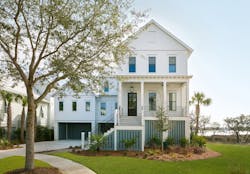
This Charleston home built in a historical district by JacksonBuilt is an example of an exterior that uses classic details in the proportions of the porch, columns, and windows (Photo: Patrick Brickman).
Many clients ask for new homes that feel old, but they don’t want their house to look like all of the others in the neighborhood. Richard Jackson builds custom homes near Charleston, S.C. In order to meet those criteria and still offer variety, he gives clients plenty of time and does research into new takes on historic characteristics.
“We spend a lot of time with clients trying to come up with new ways of designing solutions to fit city and FEMA-related building codes,” Jackson explains. “And we do a lot of research about historical details, which also keeps us from getting bored by building the same house.”
Low-Country Landscape
Building custom homes in the Charleston area poses several challenges for Jackson, owner and president of JacksonBuilt Custom Homes, which primarily works within the confines of 4,000-acre Daniel Island. The firm recently completed its 50th home on the island, so Jackson tries to ensure that each house possesses its own look.
Relying on his years of experience and his in-house design team’s understanding of low-country style, the builder takes pains to avoid repeating his own work when fitting into the neighborhood, while also meeting the city’s historical design requirements and local flood and wind mandates.
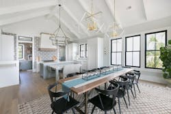
In the open kitchen, porcelain tile mimics hand-painted concrete, adding a touch of tradition to the bright space. Through the two openings, the adjoining butler’s pantry features thick, open shelving anchored to natural brick and painted to look aged, giving the appearance of an old porch that’s been enclosed (Photo: Andrea Kinnear).
People often come in with the same program,” says Allison Casper, director of design, “but by fitting homes to their sites and paying attention to solar orientation and how to make best use of a lot without getting too big or too close to the street, we can create something different each time.”
Having built homes in this historic city for a decade, however, Jackson relies on several strategies. “By creating separate masses, we can make the house look like an old structure that was added on to over the years,” he explains. “A simple exterior and a shell driveway play down the large garage, while deep eaves and long rafters add drama to the exterior.”
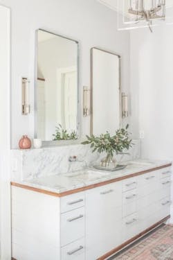
In the master bath, the double mirror flanked by sconces provides a counterpoint to the white vanity with square undermount sinks and sleek, modern drawer pulls (Photo: Andrea Kinnear).
Research helps the company add traditional details with a modern edge. For example, true historic homes in Charleston feature tall, thin proportions, such as those seen on this project’s porch columns and windows. The house mimics those forms but goes a bit further with slender windows that nearly span the entire wall height, letting natural light spill into the interior. Thin, black wrought iron railings also reference the past but with a modern horizontal orientation and squared shape.
Interiors feature high ceilings and long, open expanses. To add richness to this airy floor plan, Casper brought exterior materials inside. Patinaed brick is used on the floor-to-ceiling fireplace surrounds on the back porch and in the living room. The same brick finishes the walls in the butler’s pantry, which looks like it could have been an existing porch that was enclosed. An artisan painted the exposed rafters in the living room and master bedroom to create the look of old wood because the ceiling spans were too long to use actual reclaimed beams.
“We kept texture on the walls and ceilings like you’d see in an old house,” Casper adds, “but with cleaner lines, simpler trim, and different proportions to update the details. We always look for what’s effective and dramatic but also timeless for when the client wants to sell.”
California Dream Home
PROJECT: FERNLEAF TRANSITIONAL, NEWPORT BEACH, CALIF.
BUILDER: PATTERSON CUSTOM HOMES, NEWPORT BEACH
ARCHITECT: BRANDON ARCHITECTS, COSTA MESA, CALIF.
INTERIOR DESIGNER: CHURCHILL DESIGN, NEWPORT BEACH
LANDSCAPE ARCHITECT: DAVE PEDERSEN, NEWPORT BEACH
PHOTOS: CHAD MELLON
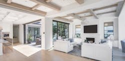
Each reclaimed beam in the living room, dining room, and master suite in this Southern California beach house weighs around 1,000 pounds. Custom builder Andrew Patterson says the home was designed and constructed to handle those loads. Including these century-old beams gives the new house an authentic feeling of history. It’s all in the wood.
“These timbers look so good because 100 years ago trees were virgin and naturally grown,” says the founder and president of Newport Beach, Calif.-based Patterson Custom Homes. “Today’s lumber is either engineered or it’s grown in three years, so growth rings are much narrower. We only build new construction, but we salvage these elements from post-and-beam homes to create the feeling of oldness.”
Pale French oak floors in similar hues as the 100-year-old ceiling beams in the living/dining area, give the bright white house an authentic beach feel.
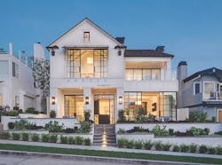
The clients really wanted black steel windows and doors to add a commercial vibe to the home’s more traditional elevations. In addition to the classic architecture, horizontal planked siding and copper roof tiles balance the modern glazing and proportions.
Maintaining privacy with such large expanses of glass presented another challenge. Being a block from the beach, of course the clients wanted to maximize indoor-outdoor connections and distant views. The long-standing neighborhood is a tight grid, with neighbors close by on all four sides. A window study helped avoid placing windows or outdoor spaces directly facing neighbors as much as possible.
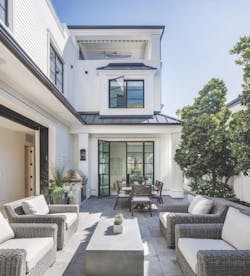
An inner courtyard on the main level provides private outdoor space with direct access to the living room, dining room, and a guest room.
In the case of this house, architect Christopher Brandon, AIA, president of Brandon Architects, created multiple outdoor spaces to articulate views both for occupants looking out from the house as well as passersby looking toward it.
A curvy freestanding soaking tub and intricately patterned tile soften the look of the big, bright master bath.
Blending traditional, contemporary, and beach styles meant keeping trim and color palettes simple. White paint and larger proportions provide a modern update, while conventional materials, such as French oak floors, brick fireplace surrounds, and shiplap walls maintain a traditional feel.
Patterson explains that many of these seemingly modest details actually cost more to build because there’s no room for error; every element must precisely align. The firm uses a cost-plus model, so it spends a lot of time guiding clients through sample budgets of houses they like in the firm’s portfolio.
“Showing clients what things cost lets them see how much they’ll spend based on how many square feet they want,” Patterson adds. “Then, if they want something extra, like reclaimed beams or steel windows, they know to look for savings somewhere else.”
Shelley D. Hutchins writes about residential construction, design, and sustainable building.
