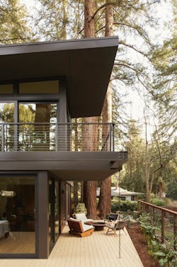
Making a Custom Home Among the Redwoods
Most prospective homeowners would have rejected this small, infill site and its crumbling cottage with redwood roots growing into the foundation. It also sits near downtown Mill Valley, California, alongside an intersection of three major streets. And although the majestic redwood trees dotting the tenth-of-an-acre lot create an outdoor oasis, they limit sunlight and restrict buildable area.
“The clients are first-time homeowners and coming from LA, just felt like this spot was home,” says Heidi Richardson, principal architect at Mill Valley, California-based Richardson Pribuss Architects.
Embracing Richardson’s vision of optical expansion through high ceilings, abundant glazing, and thoughtful spatial detailing, the clients were able to get their program of three bedrooms and three full baths without feeling cramped within the 1,600-square-foot plan. Enlarging built areas to encompass multiple outdoor spaces also allows for daily living beyond the home’s walls.
Designing windows extending from floor to ceiling or, in the case of the transoms, in long horizontal forms, allows the glass to read as integrated planes instead of punched openings. This adds to the illusion of the house being bigger than it is.
Fitting In
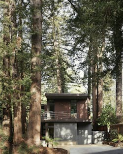
A dozen redwoods surround the house, most within the property line, several on its edge facing the intersection. The number and location of these protected trees meant large, required setbacks. Another cluster of redwoods stand on an island in the middle of the street running along the front of the lot. The setback facing this road had to be at least 15-feet, with 5-foot setbacks along the remaining three perimeters.
“Getting the three bedrooms and three baths in was really a feat,” says Richardson. “By the time we allowed for setbacks, space around each tree, and a place for a drive, we had to use all the lot we had left. Even the decks had to be within the setbacks because nothing higher than 18 inches is allowed within them.”
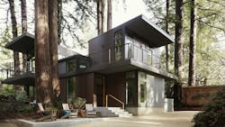
Floor-to-ceiling glazing and vertical panels making up the exterior finishes echo the tall, slender trees surrounding the house.
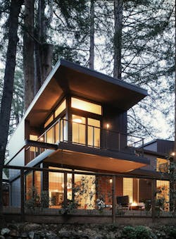
The design team was also considerate of the house not being too tall and overwhelming its compact site. Breaking up the footprint into three volumes solved this issue. A story-and-a-half living room is flanked on either end by two-story towers. The street-front tower holds a multipurpose guest room/study on the first floor with the son’s bedroom above. Surrounded by multiple outdoor spaces, the lower level of the rear tower contains kitchen and dining open to the living room. Above the kitchen is the primary bedroom suite, which opens onto a wraparound balcony sheltered by a deep roof overhang.
“We organized the layout in a way that made sense visually,” Richardson says. “So you can walk through the house and see a redwood from every room.”
Windows in open second-floor hallway are placed along the ceiling and the floor to protect privacy from close neighbors and allow for built-in storage at a practical height.
Visual Expansion
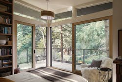
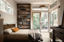
Careful glazing placement not only highlights those majestic trees, but it allows the eye to travel past the walls and make rooms feel bigger than their square footage. Each of the three bedrooms features floor-to-ceiling corner windows. In the primary bedroom, the translucent corner consists of sliding glass doors that open away from each other creating a seamless outdoor connection. The sloped roof overhangs add to the visual extension effect.
“Corner windows are a common spatial device for extending small spaces,” says Richardson. “We also incorporated high and low windows and skylights to wash ceiling and floor planes in natural light. And the roof angles up giving the illusion of expansive space and connecting indoor to outdoor.”
Another strategy for making the efficient plan live large involved orienting the public spaces—along with all the bedroom corner windows—toward the south. In addition to benefitting from long daylight exposure, the southward property features a big, landscaped yard with lots of redwoods.
Windows in open second-floor hallway are placed along the ceiling and the floor to protect privacy from close neighbors and allow for built-in storage at a practical height.
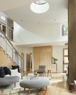
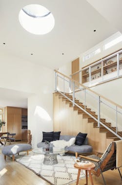
The design team speced a round skylight in the living room ceiling for a touch of whimsy.
Interior design approaches for spatial maximization include a light, natural material pallet, high ceilings and judiciously placed built-ins. Bedroom ceilings for the clients and their son slope up to 10 feet and the living room reaches 14 feet amplifying the feeling of airiness. Painted white walls and polished maple floors reflect natural light streaming through multiple windows. Natural wood kitchen cabinets and built-ins continue the light color scheme.
The built-ins played a key role in keeping rooms feeling spacious by minimizing the need for bulky storage pieces. According to Richardson it’s about, “having enough built-ins so you’re not over furnishing and cluttering the space.”
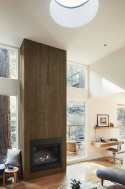
The soaring living room fireplace surround shows off the Japanese shou sugi ban finish—a pre-burned wood resistant to rot, insects, and fire—the architects used it as a nod to the home’s fire-resistance but used it inside as opposed to the typical use of the material on the outside of a building.
Protective Design
Safeguarding the site’s towering redwoods meant more than large setbacks. An arborist got involved before design development began. Richardson often works with arborists and understands that the earlier they survey a site, the easier the process of designing around the trees.
In this case, the arborist insisted on a floating foundation to protect the dense root system covering most of the lot.
A rain chain was installed to direct runoff from the balcony to below the floating deck that wraps around the house.
“Redwood trees grow as a community, so their roots below grade form kind of a mattress,” Richardson explains. “So you can’t do spread footings because you’d cut through all the roots. Instead, we design a slab foundation to go beyond the footprint and use fewer, judicially placed piers. This allows for flexibility during construction—because obviously we can’t see underground—and this helps us make changes to pier locations, within reason.”
Another major concern was fire resistance. Like much of Northern California, Mill Valley is designated as a “wildlife-urban interface” zone, or WUI. This means urban development takes place in close proximity to undeveloped, natural landscapes with a high risk of wildfires. Lots of old-growth trees, for example. Meeting the strict fire-safety standards of a WUI led to fire-resistant materials on the exterior.
Dark hues and wood-like textures helps the house blend with its natural surroundings. The design team specified mostly metal panels and cement board on the exterior. Richardson says the dark gray tones on the cement board help mitigate the size of the house and the variegated bronze metal panels with vertical seams give the illusion of a redwood cottage without using much wood.
Project: Modern Redwood Cottage Mill Valley, California
Architect: Richardson Pribuss Architects
Landscape Architect/Interior Designer: Richardson Pribuss Architects
Photos: MFMC Studio
Site: 4,600 square feet
House: 1,600 square feet
Outdoor spaces: 1,170 square feet
