An Accessory Dwelling Unit Becomes a Writer's Retreat in Austin
Accessory dwelling units, or ADUs, have been around since the first garage apartment was rented to a college student. As small “a”—affordable—housing options decrease, especially in desirable locations, more planning commissions are working to encourage the growth of ADUs. Austin, Texas, is one such place. Easing zoning restrictions in the city have led to an ADU boom.
“The city has really pushed for densifying single-family lots to diversify housing options and costs,” says Heather McKinney, founding principal of Austin-based McKinney York Architects. “ADUs allow a wider range of people—from multigenerational families to traveling nurses—to live in established neighborhoods with personality, pets, services, and to become part of the community.”
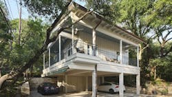
McKinney adds how ADUs also let her team stretch their skills. This project, for example, had to be inserted among multiple protected live oak trees. Project architect Aaron Taylor also designed around a steeply sloped site, protecting occupant privacy within a tight building envelope, and avoiding easements around a nearby city power transformer.
The client asked for a licensed ADU to primarily serve as a work retreat to write her books and host the couple’s grown children or other long-term guests.
“With ADUs, we still work within many of the same rules that apply to the design of a single-family home, but frequently with less wiggle room as the site has already been built out,” Taylor explains, “requiring greater flexibility and creativity on our part.”
Planning Around Meandering Live Oaks
Live oaks are treated like little gods in Texas, according to McKinney.
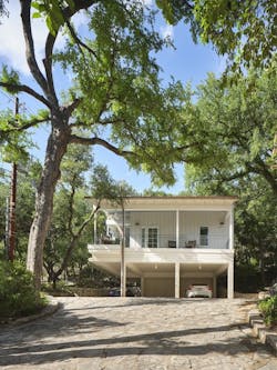
This property spans nearly an acre with multiple “little gods” across the site. Avoiding not only existing root systems and tree canopy, the design team had to also predict where they would continue to grow and avoid those areas.
The client also wanted to be visually surrounded by those thick, meandering branches. These contradicting needs meant window placement and orientation drove much of the floor plan.
The ADU angles away from the main house at around a 65-degree angle allowing for large operable windows and glass doors to direct views toward the natural surroundings.
The heavily wooded site occupies a steep hill bisected by a creek. Trees also affected strategies for addressing the slope and its waterflow because regulations prohibit changing grades by more than a few inches within critical root zones.
Siting the structure close to the main house maximized an existing flat area at the end of the drive where a crumbling carport stood.
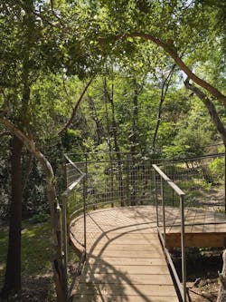
Abundant indigenous flora fills in much of the property among the large trees acting as a mini bioswale for the immediate area by absorbing and filtering rainwater runoff. The design team worked to maintain this beneficial waterflow by elevating most of the structure and using a raised walkway to access the ADU.
Not only trees and bioswale hills needed preserving, however. The homeowners and their neighbors have created an informal bird sanctuary on their adjacent properties by protecting trees and fostering a native landscape. Several types of endangered owls live in their trees, among many other species. And at least one nest in a tree close to the ADU had to be carefully protected during construction.
Big Space in a Small Footprint
“One of our biggest challenges was getting the massing to work within those trees,” Taylor adds. “We needed ceiling volume so spaces didn’t feel cramped, so we pushed up the roof where we could and then tucked it back under the canopy. We took the vernacular roof shape from the main house and then followed the branches.”
High ceilings are just one strategy used to expand the feel of this ADU. A wraparound porch cantilevers over the stone drive facing prevailing breezes and almost doubling the interior square footage.
Once again, window placement served a key role in making the compact rooms feel airy and spacious. In addition to framing verdant scenes, Taylor carefully aligned all windows with doors or other windows. This architectural strategy opens sightlines throughout interior and exterior walls into the landscape beyond.
“We try hard to choreograph views in all our projects, so as you move through a space, you find visual alignments,” McKinney explains. “For example, the long window next to the bed aligns with the bedroom doorway and also the trunk of a tree. We also try to get light from more than one source, which produces a softer light that alleviates glare and is easier on your eyes.”
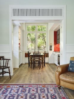
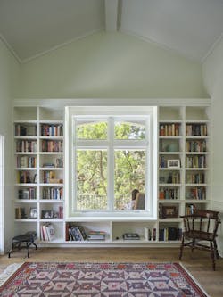
Bulit-in furniture completes the team’s spatial maximization. Kitchen cabinets recessed into wall cavities in a galley formation culminate in a tall window with a cozy built-in bench below. Designed for a writer, of course there are lots of bookshelves.
To prevent them from overwhelming the space, Taylor wrapped the bookshelves around a double window and let the vaulted ceiling soar over them.
Blending into the Natural Context
The client also asked the architects to blend her retreat into the natural landscape. Her books are often based in Texas, so seeing the live oaks and other indigenous flora from every window helps her become immersed in the story.
She also wanted to highlight the site’s stone and creek as design elements. The wooden walkway winds away from the main house to bridge the creek and curves back toward the ADU so everyone must cross over it.
“Local materials are of a particular interest to these clients,” Taylor says, “especially materials that came from the earth nearby.”
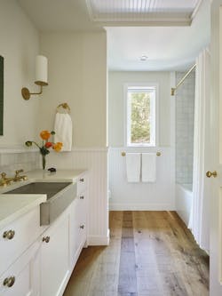
Materials sourced nearby also fit the firm’s sustainability philosophy. Reclaimed oak floor was harvested from a nearby ranch, stone was salvaged from the old carport or dug up on site, and a local blacksmith created all the railings.
The team also considered nearby man-made context, such as aesthetic cues from the main house and scale cues from the surrounding neighborhood. It’s an unpretentious house in an eclectic neighborhood according to McKinney, so she describes ADU as being in the same family but a distant cousin.
The main house contains lots of nooks and crannies from multiple remodels, for example, so the built-ins in the ADU pay homage to them with an updated form.
“Old-fashioned details with a modern twist,” describes the entire retreat, according to Taylor.
Project: Writer’s Retreat
Square footage: 550-square-foot interior, 350-square-foot porch
Architect: McKinney York Architects
General Contractor: Mark Goodrich, MG Construction Works
Ironmonger: Natalie Monson
Photographer: Andrea Calo
