A Texas Custom Home That Mimics Local Agricultural Outbuildings
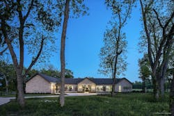
Architect Heather McKinney believes nothing is more traditional than stone. For this single-story house, the founding principal of Austin, Texas-based McKinney York Architects clad the three pitched-roof pavilions in Texas limestone. The pavilions mimic agricultural outbuildings with long, wide connecting forms similar to Texas breezeways.
Sitting at the end of a cul-de-sac and backing up to protected green space, the house was the first built in a new planned community. However, McKinney was also the first to face the strict housing association. Most of the design passed easily, but the committee said no to the standing- seam metal roof the clients wanted. Despite metal roofs being common on traditional houses—especially farmhouses—the committee couldn’t be convinced. The team used a weathered composite shingle instead.
Photo: Patrick Wong
“These historic forms dot the Texas landscape and fit well within most housing association guidelines,” McKinney says. “The simple shapes also worked well for generating completely accessible spaces—an important detail for empty-nester clients who were downsizing into their forever house.”
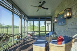
Exterior detailing brings both traditional and modern elements into play for a balanced finish. Smooth concrete plaster, for example, is a traditional material, but linear joints add a touch of contemporary finesse. Carriage lanterns flank oversized glass entry doors, while oil- rubbed- bronze handles remain simple for a minimalist look.
Photo: Patrick Wong
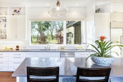
“The windows are wood but quite large scale, which adds drama,” McKinney explains. “European oak floors add character and warmth to flowing rooms, while a wide plank updates the look. Even the ½-inch round gutters are not only traditional, but also serve to make the eaves appear slimmer, which is a modern detail.”
Forms fitting the agricultural vernacular along with finishes in natural materials give an overall appearance of an old structure. McKinney’s orderly detailing and taught proportions subtly reveal a more modern refinement. The architect admits the same house could easily feel very traditional with different detailing.
Photo: Patrick Wong
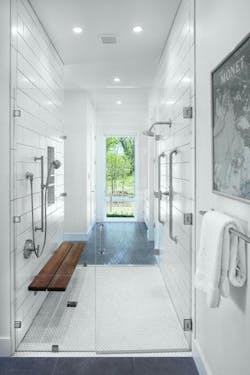
Inside the house, the clients needed to display a lifetime of collectibles, from antique furniture to travel mementos, needed displaying without making the rooms feeling cluttered. Extra- wide galleries stand in for typical hallways to link generously sized public spaces. One wall in each gallery is mostly glass. These window walls, combined with 10-foot-tall ceilings, allow the connectors to still feel gracious when filled with the homeowners’ varied objects.
“We created axial views from one space into another with a window or piece of art or something to draw attention,” McKinneys adds. This strategy also generates clean sightlines, making the mixed styles or furniture and art seem more tailored.
Photo: Patrick Wong
Photo: Patrick Wong


