Websites Done Right
“Effective” is one of those words that can have a vastly different meaning depending on context. When it comes to a custom builder’s website, one thing is abundantly clear: A website is effective if it helps generate leads and bring in new clients.
Consumers today will often peruse a company’s website before deciding whether to do business with a firm, making your website the first point of contact for prospective clients. “Before, potential clients would come into initial meetings pretty much ignorant about who we are and what we do,” says Anna Rudolph Pressma, director of marketing at award-winning custom home firm Tongue & Groove Design + Build, in Wilmington, N.C. “Now, those same potential clients come into initial meetings knowing a significant amount about our company. In a sense, our website allows clients and potential clients to do their homework about us before they ever set foot in our office.”
Here are three key tips for making that first online impression with prospects a successful one.
1. Make Eye-Catching Visuals the Main Attraction
Prospective clients want, and need, to see your work, and shots you’ve snapped on your phone just aren’t going to cut it.
“Your web content should walk the walk and talk the talk,” Pressma says. “You want your content to speak to clients logistically and emotionally because building a custom home is highly personal; it’s an emotional process for clients because you’re bringing their dream to life.”
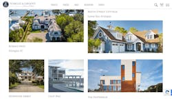
You should schedule professional photography or video shoots of finished projects to feature on your site, but also consider capturing images and video throughout a project’s construction, if doing so is in your budget, to give prospects a glimpse of the process. Tongue & Groove’s website features both high-resolution, professional images and video footage of their work right on the homepage.
“I do foresee an influx in videography so custom builder websites can have the most impact,” Pressma adds. “If you think about it, the majority of content we consume these days is video-based. Your website should take advantage of that: less written copy, more visuals. Professional videography is an investment, but done correctly, the returns can be tenfold.”
Additionally, keeping a website’s design clean and simple allows images to speak for themselves. KLH Custom Homes, in Kalamazoo, Mich., does this beautifully, using a single video, a few static images, and minimal, to-the-point language on its homepage and throughout the site.
2. Focus on Functionality
More than 40% of people would leave a website because of poor functionality, according to a 2021 survey by Top Design Firms, a directory of design, marketing, and development companies. Site visitors really do expect the gamut: compelling images that grab their attention, a clean design that doesn’t overwhelm, content that lets them get to know your business on a more personal level—and for all of it to appear (or “load”) in mere seconds. Google reports that a web page that loads in 5 seconds rather than 1 second increases the probability of a user leaving that page by 90%.
“The ease of navigating the website and ensuring it functions on desktop and mobile is one of the keys to your site’s effectiveness,” Pressma points out. “The bulk of website visitors come from mobile devices more often than not, so not having your site function properly in that format is a huge loss.”
Pressma is right: In the fourth quarter of 2021, mobile devices generated 54.8% of global website traffic, according to a January 2022 report from market and consumer data company Statista—a number that has consistently stayed above 50% since 2017 and is a clear indicator that mobile device users will certainly find your website that way.
Loading speed also plays an important role in a prospective client’s decision to stay on your site long enough to make a decision about whether to take the next step with your company, and most users won’t wait more than 3 seconds for a page to load. You can test page loading speeds using third-party tools such as Website Grader to help you understand where improvements could be made.
3. Include a Clear Call to Action on Every Page
You’ve hooked your prospective client with crisp, compelling visuals, a clean, functional design, and swift load times, but success hinges on your ability to turn a site visitor into a paying client. You must now ensure every web page has a call to action.
According to CLB Network, a luxury home builder consulting firm based in Naples, Fla., compelling, successful websites for custom builders almost always include client reviews, project photos, an introduction to the design/build process, information about services, and contact information. And, that information shouldn’t simply exist on its own pages, leaving a prospect wondering what to do next.
Instead, that information should be combined with a call to action that directs prospects to next steps. This could be a button leading to contact information, links to related pages on your site that will provide more information, or something else entirely.
Whatever the call to action, it should encourage prospects to learn more about your work and make it simple for them to reach out to you. For best results, your contact information should be easily accessible on every single page.
Bonus tip: Use SEO to your advantage
For search engine optimization (SEO), consider adding a blog and an FAQ tab to your website so you can present anticipated questions and their answers—a good way to end up in Google’s “People Also Ask” section.
Brevity and relevance are key in writing effective copy, according to a blog post from Canadian home builder marketing agency Velocity23. No one should leave your site confused about your business or your services.

