Building a ‘Happy Place’ on Florida’s Waterfront
Building a custom waterfront home is no simple construction project. It’s a specialty task requiring specific expertise. Ricky Perrone, president of Perrone Construction, a custom home builder in Sarasota, Fla., long known for its waterfront work, knows that well. “Anytime you’re building on a waterfront, there are a lot of considerations,” says Perrone, a third-generation builder. “Is it a purely beachfront home, or is it on a canal, a lake, or a bayfront lot? There are rules and zones to consider with each, as well as the types of materials you can use, and you also need to think about soil conditions.” Even straightforward homes can be tricky. “It’s why people come to us,” Perrone says, “for that expertise—because nearly every home webe build is waterfront.”
Of course, challenging as waterfront homes may inherently be to build, some are especially so, Perrone says. And “Happy Place,” a 5,254-square-foot bayside home, was one such project.
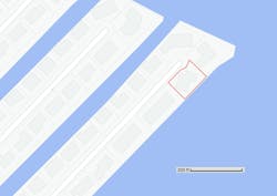
“I met the client while he was looking for property,” Perrone recalls. “He’d just found this plot near Sarasota on Longboat Key,” which is a strip of approximately 4 square miles of island set between the Gulf of Mexico and Sarasota Bay, so the area is virtually all coastline. The lot was located near the end of a mini-peninsula/cul-de-sac that juts into Sarasota Bay. “I knew right away it was going to be a challenging lot to build on,” Perrone says.
The entirety of Longboat Key is located in a Zone A Hurricane Evacuation Zone, meaning it’s most likely to be affected by inclement weather and typically is the most vulnerable and most likely to evacuate first. Ninety-eight percent of homes in Longboat Key face a flood risk, according to Redfin.
Photo: Google
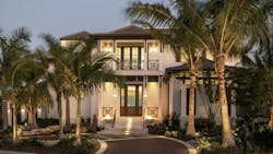
The completed home, affectionately named “Happy Place” by its owners, has since earned a host of industry accolades, including recognition in the 2022 Best in American Living Awards (BALA), in which it earned a Platinum award in the One-of-a-Kind Custom Home 5,001-6,000 square feet category.
Getting Started: Checking the Feasibility of a Bayside Lot
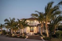
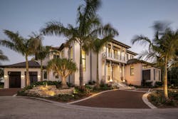
The 5,254-square-foot, concrete-framed home is built in the West Indies style, but “a modernized version,” Perrone says, and is distinguishable by its siting, which sets the building diagonally on its lot. That the home fits the lot so comfortably is an achievement for which Perrone Construction’s president is quick to take only partial credit.
The design of Happy Place was a collaborative effort from the start. “Soon after seeing the lot, I called our architects and designers—Stofft Cooney Architects for the building design and Hazeltine Nurseries for the landscaping—because we needed to quickly assess the feasibility of it all,” Perrone says.
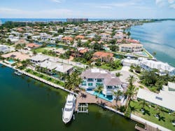
Fitting all of the project’s programmatic needs on the quarter-acre lot located at the end of a cul-de-sac demanded collaboration and creativity from the entire design team. .
Photo: Google
“It was a project that took a lot of thought,” says Stephen Hazeltine, the project’s landscape designer and the president and owner of Hazeltine Nurseries. “There was a lot of back and forth.”
The initial problem to solve was the lot itself, and not just how to fit the home on it, but whether the site was suitable for building at all. The first step: check the soil. “When you’re building near the water, soil is important,” Perrone says. The concern isn’t so much about moisture as it is the soil’s organic makeup. “Different soil conditions can lead to differential movements and settlement, which can cause cracking in the structure’s foundation.” This is particularly relevant in Florida, where soil is notoriously loose and typically sandy. Perrone and the team got lucky with the soil. “About 75% of our homes are built on pilings,” he says, “but this home didn’t require it. We elected not to build on pilings and to instead use a spread footing foundation.”
Fitting It All: Building at an Angle
The next challenge was how to fit the proposed five-bedroom, five-full bathroom home on the lot without sacrificing the homeowner’s vision, which included ample deck space and a large pool along the waterfront.
Homebuyers will pay a premium for a waterfront property. In February 2023, the median home price in Longboat Key was $1.5 million, compared with prices in Sarasota (which has only limited waterfront space) where homes cost about three times less ($495,000 median price), according to Redfin, despite the city being just across the bay.
Photo: Ryan Gamma Photography
Stofft Cooney Architects suggested siting the home at an angle, which Perrone says helped the evolution of the design and the success of the finished home in several ways.
Built at about 45 degrees relative to the street, the home’s positioning works to not only contain all of the home’s programmatic functions within the relatively tight property lines and provide additional space at the front and back, but it also helps to reconcile the scale of the home with the surrounding community. “From the front, the house reveals itself as you approach from down the street,” Perrone says. “The angle also helps keep the garages hidden, which was a nice added benefit.”
In addition to siting the house on an angle, mature palms were brought in by Hazeltine Nurseries and arranged to visually minimize the home’s size relative to other houses in the neighborhood.
Photos: Ryan Gamma Photography
Near the front water feature is a ponytail palm. Landscape designer Stephen Hazeltine says it’s rare to see such a mature specimen of this very slow growing plant native to Mexico.
Photos: Ryan Gamma Photography
The home’s angled siting also heavily influenced the design of the outdoor areas.
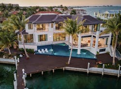
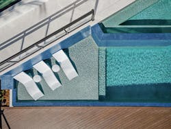
“The owners really wanted a large pool, but local codes restrict how close you can build a pool to the seawall,” Hazeltine explains. “There’s only about 5 feet of space behind the home. So here again we used the home’s angled orientation, and also its elevation on footings [to accommodate all of the design requirements].”
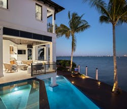
At Hazeltine’s suggestion, the pool was designed to continue under part of the home. “We wound up creating a really cool private area,” he says, referring to the part of the pool that continues under the home’s balcony, which projects out over the pool and is supported by a column going directly into the water. “It really worked to our advantage.” The same proved to be the case with the decking that leads to the dock.
Hazeltine says the column in the pool isn’t in danger of moisture damage because of how it’s built. “The pool’s shell was poured around the column itself,” he says, “so it’s basically separate from the pool.”
Photo: Ryan Gamma Photography
Local codes prohibit building over the seawall, so in extending the deck, Perrone says, the team decided to cut down into the wall in order to extend the deck out and connect it to the dock.
Photo: Ryan Gamma Photography
The deck and dock surface are made from a composite material resistant to the corrosive effects of coastal conditions. The decking continues from the pool surround out to the dock, and maintains the angle of the home’s orientation to the water, which provides space for the owner’s yacht without compromising water views from the rear of the home. “The owners’ boat has a really nice transom, and they wanted to use it as additional casual living space,” Perrone says, “but we wanted to keep it from obstructing the view of the water and downtown Saratoga, which you can see across the bay.”
The idea of connecting the deck to the dock is another space-creating solution for which Perrone gives credit to landscape designer Hazeltine. “The pool didn’t leave much room for deck space,” Perrone notes, “and Stephen came up with the idea of extending the deck to the dock.”
The angle of the home and the landscaping create well-framed views of downtown Saratoga from nearly any window on the rear elevation.
Photo: Ryan Gamma Photography
In a typical waterfront home, Hazeltine says, “you can only build so much deck area for sitting over the water. Usually, that would be at the end of a dock or something. In this case, we used that extra space to extend and connect the pool deck area to the dock itself, resulting in one large deck space.”
Connecting the Exterior With the Interior
The home’s aesthetic is inspired by West Indies architecture, which is known for its symmetry, with columns, louvers, doors, and windows often configured in relation to a central axis; high ceilings, with wood beam details, which are both handsome and practical, encouraging warmer air to rise and cool breezes to flow through the interior; and light colors that promote a feeling of coolness in a hot, humid climate and serve to contrast with the wood tones of floors and furniture. The home’s “modernized version” of the style takes inspiration from these traditions, but has its own take, using more resilient materials and featuring larger and more frequent access points from interior to exterior.
While the home’s design evolved throughout the planning and construction process, the owner’s vision for how the home would be used was uncompromising: it would be a “happy place.”
“They wanted it to be like a resort,” Hazeltine says. Perrone adds: “This client was all about creating a space they could enjoy with friends and family. I remember them asking for an eight-person hot tub. Not a lot of people ask for an eight-person tub. It wasn’t because they were going to have eight people living there; they wanted it to be a place for entertaining.”
The pool’s concrete shell was poured in such a way that it’s separate from the house, Hazeltine says, “so if there’s any movement of the pool or the home, one won’t affect the other.”
Photo: Ryan Gamma Photography
Interior designer Angela Rodriguez says she wanted the home to have a “strong feeling of connection to the land and water,” and this was a guiding principle in her design of the interiors.
Photo: Ryan Gamma Photography
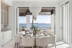
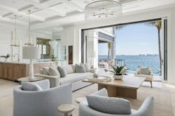
In keeping with that intention, Perrone and the team designed the property so spaces flow seamlessly from exterior to interior. Large windows and doors, including multiple glass panel systems, and using some of the same materials from inside spaces in the outdoor areas helps to achieve this effect, says the home’s interior designer Angela Rodriguez, owner of Angela Rodriguez Interiors. “For example, the same stone flooring flows between inside and out to create a seamless connection that encourages an indoor-outdoor feel,” she says.
But exposing materials to the salty air off the bay also created a challenge for the design team—one they’d faced before.
“A lot of waterfront homeowners like to keep their windows and doors open when it's nice out, but it’s humid in Florida and the salt air can be corrosive over time,” Perrone points out. The back side of the home is most at risk, Hazeltine adds. “There’s just no way to prevent it.” But there are ways to mitigate the wear on materials when building in these conditions.
For the decking and specialty light fixtures, the team selected composite wood materials designed to withstand corrosion, and protecting interior surfaces against the Florida coast’s potentially damaging conditions was not all that different.
While the trim and molding details are painted to mimic the look and texture of wood, they are actually made of a composite material. And their appearance looks authentic: “If you were holding the corbels,” Perrone says, “you wouldn’t be able to tell the difference.”
Photo: Ryan Gamma Photography
“We try to use materials and techniques that will stand up to rust, rot, and corrosion—materials that aren’t going to require high levels of maintenance from the owners,” Perrone explains. “We used a lot of composites in Happy Place, especially on the floors. Engineered wood stands up well to humid environments because there is no cupping or warping like there can be with traditional wood floors.”
The home features not only composite floors, but also trim and molding details that are carefully detailed and fastened to reduce the effects of moisture on any joints. Perrone says, “we use screws instead of nails to make sure trim is fastened carefully and won’t move in the high, changing humidity.”
Achieving the Interior Look, Without Sacrificing Comfort or Convenience
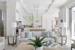
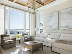
Composites were important in this home because they allowed the owners to achieve the aesthetic they wanted without the burden of high maintenance. “Our clients requested that the interior include plenty of fine trim carpentry and molding details, but that the overall feel of the spaces remain clean and contemporary,” Rodriguez says. “So our task was to strike that beautiful balance with the interior detailing throughout. The ceilings were a particularly important part of that.”
The many interior details help to provide structure and continuity throughout the home, while the spaces maintain a feeling of uncluttered openness and connection to the water views.
Photo: Ryan Gamma Photography
Throughout the home, detailing plays an important role, helping to define individual rooms as well as the home as a whole. “We were also able to help play a part in the selection of most exterior finishes and lighting to help maintain that consistent look and feel both inside and out,” Rodriguez says.
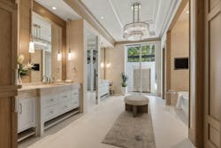
The home’s primary bath features a mix of natural and natural-appearing materials, from metal to stone to engineered wood.
Photo: Ryan Gamma Photography
Rodriguez guided material and color selections for the home, which, she says, aimed for an open, natural aesthetic inspired by its waterfront location and the views outside. “Nature is always one of our biggest sources of inspiration, and it’s a big reason why the clients we work with are choosing to build homes in Florida,” she says. “We wanted that feeling of connection to the land and water to be felt throughout the home in the materials we chose, such as natural stone, wood, and grass cloth.”
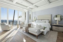
It’s by design that Happy Place has multiple access points to the outdoors, including from the main living area, the primary bedroom, and the primary bath, and makes extensive use of massive windows. “Every room facing the bay has a view of it,” Perrone says, discussing the window package for the home. “We have 43 years of experience, and we only use window and door systems with which we’ve had great success.”
Because of the home’s breezy openness and Florida’s hot, humid climate, the home’s conditioned spaces also required a unique approach to ventilation in order to maintain indoor comfort. “We take special care in handling moisture for waterfront homes, and Happy Place was no different,” Perrone says, explaining why he selected a variable speed air conditioning system for the home.
The difference between a traditional, single-stage HVAC system and a variable speed system is that the latter is always running, Perrone explains. “A variable speed system never shuts off, it only ramps up or down. It never turns off and so is always dehumidifying the air.” A variable speed HVAC system will use 25% less power than a single-stage HVAC to run the same amount of air, according to the US Department of Energy.
The complete package for this Florida custom home—its siting and orientation, selection of materials, connection to the outdoors, light color palette, climate-appropriate mechanical systems, and strategy to ensure the longevity of building components and finishes in a challenging coastal climate—represents an informed, holistic approach to building on the waterfront. And it delivers what’s required to turn a home into a resort-like sanctuary that the homeowners can enjoy as their happy place.
Builder | Perrone Construction, Sarasota, Fla.
Architect | Stofft Cooney Architects, Naples, Fla.
Interior Designer | Angela Rodriguez Interiors, Sarasota
Landscape Design | Hazeltine Nurseries, Venice, Fla.
Pool | Water Designs of Sarasota, Sarasota
