Custom Remodel: Welcome Changes for an Old Tudor
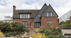
On the surface, this 1931 Tudor-style home on a sunny double lot in Seattle offered the homeowners plenty of enchanting details and outdoor living opportunities. However, it also presented the family of four with dark living spaces, an awkward layout, and little outdoor connection. Plus, it failed to maximize distant views of Lake Washington and Mount Rainier.
Architect John DeForest highlighted the existing home’s appealing attributes while updating it for the client’s lifestyle and tastes.
Project: Modern Family Tudor, Seattle
Architect: DeForest Architects, Seattle—John DeForest, AIA,
Mark Slivka
Builder: Schultz Miller, Seattle
Interior design: OreStudios, Seattle—Andy Beers
Structural engineer: Swenson Say Fagét, Seattle
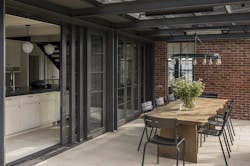
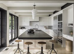
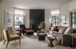
The clients wanted their home to be the spot where their kids’ friends want to hang out. The yard already had a sports court and multiple entertainment areas, so the next logical step was locating living and kitchen spaces adjacent to that yard. “But everything was on the wrong side,” DeForest says, “so we flipped the floor plan by swapping living and kitchen to the south side of the house to open into this big, active yard. And we moved the guest room to the north corner facing a tall hedge, to be more secluded.”
The second-story bedrooms got a refresh with either a window seat or an oversize window to frame the views. And a playroom climbing wall makes good use of steeply sloped ceilings. In the master suite, an original hipped roofline and tiny dormers cut off the lake and mountain vistas. Bumping out the exterior wall with a long, continuous dormer maximizes views and natural light. DeForest admits to obsessing over the proportions of that dormer and the size of the windows because he wanted to make sure he respectfully applied modern sensibilities to the home’s historical character.
“We pay attention to how we intervene in a house that has a strong language we don’t want to undermine,” the architect explains. “One approach includes making clear where an intervention occurs. Another is to infuse modern function—like opening up the stair treads—while honoring the history, such as adding curved balusters that evoke classic Tudor arches.”
Modernizing a 90-year-old home also involves more practical updates: creating a tighter building envelope, for example, and installing energy-efficient systems. But such updates often result in unexpected costs, and predicting expenses on a comprehensive renovation can be tricky.
To keep everything transparent, DeForest Architects provides clients with hand-drawn sketches, along with low-tech renderings, to facilitate easy, early decisions. Selecting a contractor with a clear understanding of what may happen in a major renovation also reduces stress for all involved.
DeForest often works with builder Schultz Miller on projects like this one because the company has set systems and processes worked out in advance. “We talk with clients about budget early and regularly, and our contractor provides advisory estimates along the way,” DeForest says. “We want clients to participate in the design process, so we need to give them the tools and language to do that.”
