A Condo Remodel in a Chicago Icon
Often good design relies as much on what an architect deletes from a space as what gets added. That concept played heavily in Vladimir Radutny’s—principal of Vladimir Radutny Architects—approach to renovating a 1,800-square-foot condo on the 84th floor of Chicago’s iconic John Hancock Center (now renamed 875 North Michigan Avenue).
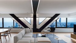
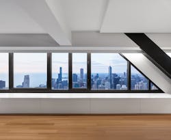
The architect's primary goals included revealing skyline views and structural steel beams by removing multiple walls and layers of material obfuscating the building’s trademark cross bracing.
The project came from one of the few cold calls Radutny has ever received. The client and his husband knew the architect’s work, including other units in the building, and thought Radutny could solve the many issues within the existing space.
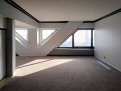
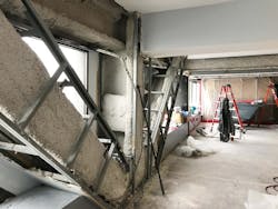
“We were surprised with how compartmentalized and dark the unit felt,” Radutny says of his initial walk through with the client. “The deep footprint, built out structure, and low ceilings severely limited outside views and natural light. And the apartment’s main feature—steel cross-bracing—was concealed beneath a thick layer of fireproofing and drywall.”
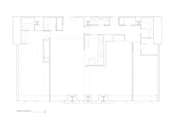
Although the architect completed other projects in the building, Radutny took a unique approach by crafting the complete design after demo. The entire interior was gutted to the perimeter—including a lot of asbestos abatement—to reveal the building’s shared ventilation, plumbing, and wiring stacks, along with any other existing constraints to consider.
“After demo, we realized we could gain quite a bit of square footage by building tighter and closer to the infrastructure,” Radutny says. “So, we carved into walls and ceilings where it made sense instead of covering it all with a single flat plane.”
Partnering With an Experienced Contractor
Radutny wanted to tackle this project with a contractor he worked with before and, crucially, one who understands architecture. Matt Harder is co-founder of local design/build firm Harder Brothers Construction & Design and happens to be one of the architect’s best friends. The clients bought into the benefits of bringing Harder onto the team from the beginning.
“[Harder] could scrutinize a detail and see a creative way to execute it,” Radutny says. “A few times we’d see our design not turning out as we had envisioned, so working with someone who’s a friend and really understands design allowed us the flexibility to figure out how to fix it.”
One example of Harder’s input involved enclosing the primary bedroom suite. In order to maximize space, Radutny’s design pulls partitions away from perimeter walls and the ceiling. This technique allows light to permeate the long, narrow footprint and generates visual continuity.
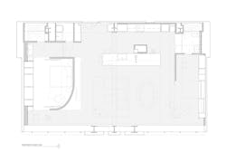
The design team studied views throughout the space and used a curved wall topped by a dropped platform to enclose the bedroom.
As you walk into the unit, this wall is immediately to the right and the curve draws the sight line toward the expanse of windows and skyline vistas.
The dropped ceiling allows natural light to pass into interior living spaces, but as the team began to enclose the wall, Harder felt that the typical drywall formation was “clunky.” He instead suggested finishing out a steel plate for a thinner profile that still mitigates sound carryover.
Flexible Floor Planning
“How to get light as deep as possible into the unit?” “How can occupants see the entire length of the space from within?” Those were the questions Radutny worked to answer through the design that Harder executed.
Those questions fit with the architect’s overarching philosophy, which he borrows from the art world. It’s a technique called phenomenal transparency—the visual moving through space without physical continuity.
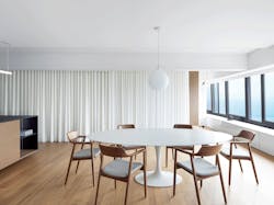
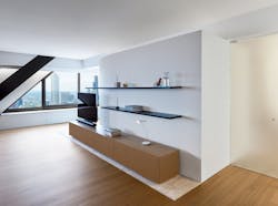
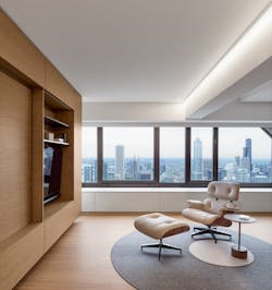
This approach was ideal for this long space that was limited to receiving natural light from a single source. Details used that reinforce this concept include the curved wall, dropped ceiling, mostly open floorplan, and continuous runs of custom built-ins. <
Even the walnut used to finish the cabinet walls was carefully detailed with the grain running horizontally to portray a seemingly endless continuation of movement from end to end and one surface to another. Orienting all the doors along the interior back wall toward the window wall (and specifying sandblasted glass for them) also enhances the phenomenal transparency design thread.“One major design goal this approach helped us achieve was getting shadows and light playing throughout the space as the sun’s position changes throughout the day,” Radutny says.
Composed Designing
Inserting the needed home elements into a constricted space nearly 1,000 feet in the air requires a delicate plan that doesn’t distract from panoramic views or feel overwhelmed by the historic building’s massive steel supports.
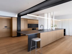
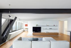
Radutny focused on reducing and refining each aspect of the design from materials to color palette to cabinetry to lighting. The steel beams are painted black to minimize their mass. They serve as a design feature, create a dialogue between the contiguous rooms, and add to the space’s cohesive visual continuity.
As far Radutny knows, no other residential unit had replaced the thick layers of asbestos and drywall concealing the steel with more modern fireproofing. (One of the building’s commercial spaces had, but those codes are vastly different.)
Approving the plan to expose the structural steel involved numerous permits because the building lacks a sprinkler system, and city planners were understandably cautious. The team hired a fire prevention consultant who first identified the exact type of steel and then calculated how much intumescent paint they needed to apply—in specified thickness of layers—to protect the structural beams.
Aside from the beams on the windows, the team opted to highlight the continuation of the unit’s steel framing in select spots while concealing it in others.
The exposed cross braces connect to the central ceiling beam that then wraps down bisecting the kitchen cabinet wall. The exposed steel here creates a textural divider within the open public spaces. There are two other side beams, but the architect chose to encase them in drywall.
“Understanding how you can refine the composition of parts is especially important in a small space like this one, so they become less distracting to the larger goals, which are often about light and views,” Radutny says.
Architect: Vladimir Radutny Architects, Chicago
General Contractor, Cabinetmaker: Harder Brothers Construction & Design, Chicago
Photographs: Adrien Williams
