Cottage Industry for Vacation Homes
Cabin or cottage, lake house or lodge—whatever families call the special place they go to kick back and be together—it’s an opportunity to set the stage for memories that will last a lifetime. Those memories will likely be fonder if the house contains comfortable communal spaces as well as areas where people can get away (if in doubt, ask anyone who has vacationed for a week or more with extended family).
Read More about Vacations Homes:
* A mountain retreat and a reworked A-frame
* Get aways in Jackson Hole and Mexico's Soliman Bay
* Vacation homes in Malibu, Indian Beach, Del., and Gordon Long Point, Conn.
Creating a division between public and private spaces, not to mention providing a defined entryway, can be challenging with a snug footprint or a limited budget. Yet it’s a challenge that builders and designers are facing more frequently as new-home sizes begin to decline after increasing and then leveling off in recent years, according to a recent NAHB Eye on Housing report. At 1,300 square feet and 2,055 square feet, the following two projects succeed in subtle but meaningful ways.
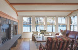
Details such as oak floors and the Douglas fir fireplace surround and ceiling beams create a cozy, old world feel (Photos: Gaffer Photography)
Lake Life
“With cabins, my goal is to make a place that’s really special and magical,” says Christine Albertsson, partner at Albertsson Hansen Architecture, in Minneapolis. Even without its postcard-pristine setting, Fish Trap Lake Retreat, in Cushing, Minn., has those two qualities in spades. And the cabin has a fresh-but-familiar appeal—a hallmark of the firm’s work.
The clients, who had long vacationed on the lake, purchased a slab-on-grade cinder-block house that sat close to the water, intending to enlarge it for visits from a growing family that includes five adult children and many grandchildren. It soon became clear, however, that the house would have to be torn down and moved farther back from the shoreline to meet zoning requirements. Although the owners received a variance that reduced that distance to just 2 feet, the buildable area was a bit cramped, hemmed in by a wooded hill and a retaining wall.
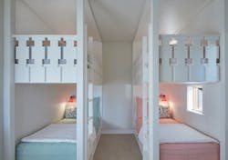
Scandinavian-inspired rail cutouts add charm to the cabin's bunk room.
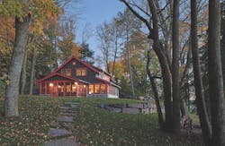
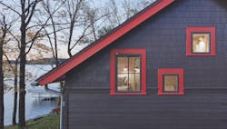
The new cabin sits comfortably on the tight lot, thanks in part to its transparency and how it’s approached: As visitors crest the driveway, they see a dark brown, monochromatic building with bright red trim reminiscent of Scandinavian cottages. “The dark exterior was a selling point to the county—this is not an imposing structure that will stand out,” Albertsson says. A screened porch comes into view first, and through it a sighting of the lake. Inside the entry vestibule to the left, visitors turn right into the cozy great room, which also looks out to the water through large windows. A pantry, laundry, and efficient master suite fill the rest of the main level. Upstairs are three bedrooms, including a bunk room, and a bathroom, all organized around a central stair that rises up toward views of the lake.
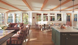
Given the small footprint, the challenge was maximizing the size of the communal space. To accommodate the clients’ request for one large, central room containing the kitchen, dining, and living areas, the architects kept the bedrooms compact and the circulation efficient. It may seem counterintuitive, but “there are no gigantic doorways leading outside,” Albertsson says, which would make the room feel more expansive but would also require more circulation space. “You can sit right next to the windows and be closer to the outdoors, rather than having to open up a wall.”
A case in point is the dining area, where a table for 10 and a built-in bench sidle up to the screened-porch windows. A similar condition occurs in the master bedroom. Just big enough for a bed and a nightstand, the room is detailed with wainscoting and pine windows. “The window sill became the height for wainscoting around the room,” Albertsson says. “I love how tiny this room is and how the bed is so close to the windows. The owners can have them open and hear the loons and feel the breezes.” The master en suite bath doubles as a powder room that users can access without going through the bedroom.
Upstairs, two bedrooms, a magical bunk room that sleeps six, and a full bath are set up for the adult children and their kids. Here too, craft-inspired details add emotional appeal. Painted beadboard lends an old-world feel, as do the bunk railings with Scandinavian-inspired cutout motifs. “In Duluth, you see exteriors of houses done like this,” Albertsson says. “It’s a simple way to make a railing—mount a board to the side of the bed frame going down over the bottom plate of the bed, attach a railing to the top, and make cute cutouts between them. The owners’ last name starts with H, so we made a stylized H on its side with the cutouts—and for the stairwell too. The builder did a phenomenal job.” A window overlooking the stairwell next to one of the bunks is another whimsical touch.
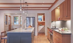
The cabin is elegant and clean-lined but homey. Douglas fir on the ceiling beams and fireplace surround warm the great room. And the kitchen is simple and symmetrical, devoid of hulking elements that would get in the way. The range hood tucks into a soffit, and the refrigerator fits between the pantry and front entry. Countertops are made of an easy-to-clean quartz composite material. “The kitchen blends seamlessly with the architecture—that’s always our goal,” Albertsson says. “It’s functional but blends with the logic of the house.”
That effortlessness is evident on the outside, too. Clad in fiber-cement siding with a stone base, the building bends to the logic of its lakeside setting, showing no sign of the lot’s constraints. “I always use my imagination and think through what would be a delightful and unexpected way to make use of the site,” Albertsson says, and it’s clear she’s succeeded.
Asher Slaunwhite Architects transformed a pair of 1960s cottages in Ocean City, N.J., where they serve as a beach getaway for two siblings (Photos: John DeMaio)
Identical Twins
Sited right on the beach in the Gardens district of Ocean City, N.J., these twin cottages caught the eye of future architect Mark Asher when he was growing up in the town. “They were virtually on the beach, which was really unusual,” says Asher, now principal of Asher Slaunwhite Architects, in Jenkintown, Pa., and Stone Harbor, N.J. “I was a little boy when they were being built in 1963, and I remember playing on the construction site. Because the cottages are right on the beach, they’re iconic. Everyone knows them.” Little did Asher know that more than 50 years later he would be hired to give the twin cottages a total makeover.
Purchased by a couple wanting to share them with two adult children who have families of their own, the cottages are ideally located in the city’s northernmost neighborhood with sweeping views across the inlet to Absecon Island. But at 1,300 square feet each, they were basically a double-wide with a pitched roof, Asher says.
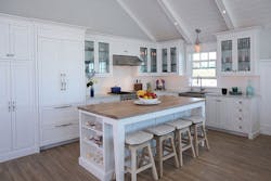
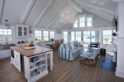
Raising the roof pitch and creating cathedral ceilings increased the sense of interior space.
“We had a lot of legal challenges because of the sensitive site,” he recalls. To address those environmental issues, the cottages were raised 4 feet off the ground on piers and a new bulkhead was installed to protect against storm surges. Over the course of a multiyear design and construction process completed in 2016, each identical house was lifted off its foundation, put back in place on a raised foundation, and renovated from top to bottom. “We had to park the houses on the street while new pilings and foundations were constructed,” says Rebecca Fellerman, project manager and associate at the firm. “We got permission to close the street in winter while the foundation work was being done.”
Another requirement was that the renovation retain the exterior walls. That was fine with the clients, who were drawn to the structures’ simple forms. Although adding a second story was prohibited, the design team was able to increase the roof pitch—one of the big differences between the old and new structures. That move led to the creation of a cathedral ceiling in each of the great rooms, bringing in the view. The additional height also creates loft space for a children’s playroom, which can be accessed by a ship’s ladder, in each house. “We steepened the roofs for nicer proportions and to sneak in a loft,” Asher says. “But as for the form itself, you’d recognize the old versus new.”
With the basic form a given, the team’s task was to configure the interiors to create separation between public and private spaces. Each new cottage includes an open-plan living room, dining room, and kitchen, plus two bedrooms, a tiny bunk room, and a bath. The design team captured space from a bedroom to create an entry foyer that separates the bedrooms from the living area. The kitchen, formerly in a deep alcove, was brought into a corner of the living space, resulting in a square and graciously proportioned great room. And because acoustical privacy is important in a small building, the architects specified extra insulation in the floors and walls.
Boat cabins inspired the interior fit-outs, and their detailing enriches the simplicity of that aesthetic. The builder, Michael Buck, of Buck Custom Homes, in Ocean City, N.J., is “talented beyond belief,” Asher says. In the dining area, a built-in bench provides storage and allows the table to be pulled close to the outside wall. Other space-saving features include sliding barn doors, built-in cabinets, and a custom soaking tub that doubles as a standard-size shower pan. White-painted shiplap walls, hardwood floors, and Carrara marble countertops lend an overall airiness.
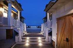
Given the community’s initially fierce opposition to this project and the eight-year-long approval process, Asher’s team was eager to impress. With cedar siding and deep blue shutters, the cottages evoke the New England vernacular of the early 20th century. Their classic charm—a breath of fresh air in a beach town where the typical new-build is a multistory mansion—owes much to the exterior detailing. For one of the cottages, the architects flipped the front door from one side of the building to the other to create facing entries and a courtyard between the two structures.
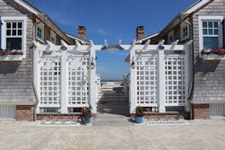
Another critical improvement is a covered porch at the entry steps (because the cottages are now elevated). After parking in front, the owners pass through a trellised gateway to the entry courtyard where they are greeted by an unobstructed view of the ocean. The trellis replaces a perforated concrete block wall. “Everything that was there had to be recreated in some way,” Asher says. A dune fence reinterpreted in aluminum perfectly frames the twin dwellings from the street.
The formerly dusty, dilapidated cottages now embody every summer vacationer’s dream. With their quiet beach aesthetic, they stand apart in their simplicity, evidence that a vacation complex can be memorable without multiple balconies, Palladian windows, and turrets. “There’s something a bit manifesto-like about them because of the extremely high-quality materials and detailing, such as the rafter tails,” Asher says. “That’s what a smaller building allows you to do.”
Cheryl Weber writes about architecture and design.
Related Topics:
* "Vacation Homes: Second to None"
