Design

Custom Homes: Natural Beauties

Site characteristics shaped the design of these two houses, which have spectacular views of water, hills, and valleys from every room.

A custom home on a choice-view lot needs to be properly oriented. Often such properties are irregularly shaped and have multiple elevation changes that can be challenging, as was the case with the two residences featured here. But the builders and architects applied their skill and experience to create homes that capitalize on the natural beauty of each site.

Surveying the seascape

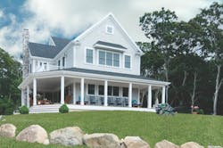
This Cape Cod, Mass., home was framed to withstand hurricane-force winds and has hurricane-rated window glazing. The siding is dipped cedar shingles and the roofing is  30-year architectural shingles. Photos: Gerry Kehoe for the MZO Group

There was no question that this 3,754-square-foot home on the western coast of Cape Cod, Mass., would make the most of its ocean views. The house is less than a mile from the water and nestled among lush, rolling uplands.
 
The clients, an empty-nester couple, wanted a traditional New England farmhouse with a wraparound porch, similar to another home designed by the architect, Andrew Zalewski of The MZO Group, Stoneham, Mass.
 
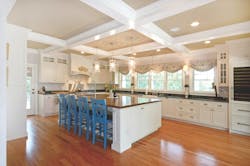
“The big thing [for the wife] was to have a kitchen on the ocean side,” Zalewski says. “She wanted a lot of glass so she could look out and see the water each morning.”
 

The kitchen is a true baker’s kitchen, says builder Pat Sciuto. There are two ovens, two sinks, a wine refrigerator, and a walk-in butler’s pantry. The cabinets were custom built and painted, and the 8-by-12-foot island has a walnut countertop.
The lot is about 10 feet above the street, so Harbor Homes Building and Remodeling of East Falmouth, Mass., smoothed out the grade for the driveway approaching the rear-loaded garage.
 
Zalewski made the back of the house a bit wider to accommodate windows in the other rooms. The main living area and the porch share the view angles as well as all the bedroom suites. There’s a first-floor laundry room for the homeowners as well as a second-floor laundry room for guests.
 
But the primary focus is the porch, which Zalewski calls an “active porch.” Ordinarily this would be the back deck, but here it’s a 12-foot-wide porch with plenty of room for furniture. “It was important [to the clients] to provide a nice streetscape for the neighborhood,” he says. “The front porch is a gift to the street.”
 

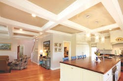
Coffered ceilings in the kitchen and family room provide spatial definition without walls. “Because it’s an open plan, we needed beams to hold the ceiling up,” says architect Andrew Zalewski. “We integrated those beam lines into patterns and coffers on the ceiling.”

The open plan, augmented by sensibly placed wall elements, keeps the desired traditional feel, yet the flow is quite modern in concept. The ceiling treatments use traditional elements to enhance the structural members that allow for an open floor plan.
 
The entire second floor is intended for the use of the couple’s adult children and grandchildren when they visit. There are three bedrooms, three baths, a bunk room, and a laundry room, in addition to the family room or common room, as it’s labeled on the floor plan. The common room opens to a deck and has a snack bar in the corner.
 

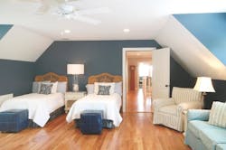
The bonus room over the garage is used as a bunk room for the homeowners’ visiting grandchildren. 
The bunk room isn’t just a place for the grandchildren to sleep. “When the next generation comes to visit, they want permanent places to leave their stuff,” he says. “They don’t want it to feel like a hotel.”
 
Pat Sciuto of Harbor Homes says the clients originally planned a walkout basement on the right side of the property, which drops off slightly.  “As it turned out, we brought a lot of the excess fill over to that side, put in a retaining wall and gave them a nice yard, since they don’t really have a back yard,” Sciuto says. “They landscaped it and put in a patio and barbecue grill.”
 

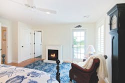
One of the second-floor bedrooms has a fireplace and access to a deck overlooking the ocean. 
 
The home is not in a flood zone, but it is in a hurricane wind zone, so special framing connections and calculations were required to satisfy local building officials that it could withstand winds of 100 miles per hour or more.
 
In more than one way, this home is a dream come true for the clients. “They actually looked at this piece of property when they were much younger but didn’t buy,” Sciuto says. “Years later they returned and it was back on the market, so they bought it. It seemed like it was meant for them.”

A little romance, a little country

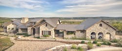
To capture the best possible views, architect Rick Burleson designed an elongated home on a sloping site. The foundation ranges from 1 to 14 feet in certain areas. Charcoal-gray limestone on the exterior and interior matches rock ledges on the property. Photos: Casey L. Fry
Another empty-nester couple wanted a home that would grow with them through the years. They purchased 12 acres of rolling terrain in Texas Hill Country, overlooking the Wimberley Valley and the Blanco River, and plunged into planning their dream house with the help of architect Rick Burleson and builder Cody Schmidt.
 
Schmidt, principal of Schmidt Custom Homes in Dripping Springs, Texas, describes the 2,800-square-foot home as masculine on the outside with a romantic, feminine feel on the inside. “The two mesh together very well,” Schmidt says.
 
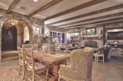
Douglas fir shelving flanks the living-room fireplace instead of cabinetry. The mantel is reclaimed wood from docks on the Mississippi River. Stained concrete floors were used throughout the house.
While there were a number of buildable sites on the property, in order to get the best possible views the house had to be oriented on the edge of a gradually sloping hillside with a range of elevations from 8 to 10 feet. Burleson, principal of Burleson Design Group in Wimberley, Texas, designed a long, narrow house divided into three primary components: the master suite on the east end, the living/kitchen/dining area in the center, and a guest bedroom and study on the west end. Breezeways (known as dog trots in that part of the country) link the components.
 
The three separate living areas offer privacy for the clients as well as their growing family and guests. The master suite has a stackable washer and dryer and a small kitchen concealed behind a wall of cabinets, which will allow the space to serve as a standalone living area in the couple’s later years. Most doorways are 36-inches wide, and steps were minimized throughout the plan.
 
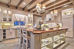
Venus white granite graces the kitchen’s countertops, and glass-front cabinets display the homeowners’ vintage teapot and Depression-era glass collection. The hand-painted tiles above the range are from London. 
The clients wanted an eclectic blend of cottage and Old World characteristics, says Burleson. Instead of the white limestone typically seen in the region, they opted for charcoal-gray limestone that matches the rock ledges on the property and was shipped in from a quarry in Lueders, Texas.
 
The stones and wood beams throughout the house anchor the strength and boldness of the design, but it’s the details that set it apart. Rough-sawn, gray-stained Douglas fir beams accent the kitchen and living-room ceilings. The century-old mantel above the living-room fireplace was reclaimed from the Mississippi River docks. Surrounding the fireplace are built-in Douglas fir shelves instead of the usual cabinetry. Another mantel was cut from an old pecan tree on the couple’s family ranch in Texas. “The builder did a fantastic job of execution,” Burleson says.
 

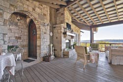
The covered deck is truly an outdoor living room with its fireplace, flat-screen TV, comfortable furniture, and kitchen (not shown).

The outdoor living space is one of Schmidt’s favorites with its kitchen, fireplace, flat-screen TV, and porch bed. In the spring and summer, the homeowners enjoy prevailing winds and breezes from the south and southeast.

May the (site) force be with you
Wimberley, Texas, architect Rick Burleson specializes in orienting homes for maximum views based on his analysis of a site’s topography, sunlight, and breezes.
 
“The core of our design approach is based on designing to the site forces,” Burleson says. “What I have learned over many years is that the more you allow the site forces to shape the design, the better the house will turn out. If you respond to the elements in a profound way, the house ends up being really enjoyable. All the rooms have a view because it was designed to fit the topography just right.” 
 
To maximize views in the Texas Hill Country home featured in this article, Burleson elongated the house on a hillside.  “There were challenges posed by the substantial slope, which caused the foundation to range from 1 to 14 feet in certain areas,” he notes.
 
When siting the Cape Cod home featured first, architect Andrew Zalewski used Google maps and compass work to help position the house with the main living areas facing west. The 100-by-160-foot site is roughly pie-shaped and sits right at the outside of the street’s gentle S-curve.
 
“Putting the house in the right position on the lot, where it’s aligned with the lower part of the street right-of-way, actually provides the view corridor out toward the ocean,” Zalewski says. CB


About the Author

Susan Bady, Senior Contributing Editor

Sign up for Custom Builder Newsletters