Small Wonders
Whether they’re production or custom, small homes are challenging to design. There are many considerations, including ceiling heights, daylighting, storage, and circulation space.
“Design efficiency is the key,” says Bristol, Vt., architect Elizabeth Herrmann. “Every square inch has to be put to good use and ideally serve multiple purposes.” Adds Mark Turner, owner and founder of GreenSpur, a design/build firm in Falls Church, Va., “Small, if it’s done well, is as good if not better than big.”
For the purposes of this article, “small” is defined as 1,600 square feet or less. The featured homes are so well designed that a family of five comfortably resides in the 1,000-square-foot Virginia home, while the owner of the tiny house in Vermont hosts contra dances in his living room.
Family Plan
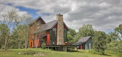
Turner originally intended One Nest to be a concept house, but he fell in love with it and decided to make it his personal residence. He, his wife, and their three children live in the modern farmhouse, complete with tower, which occupies an 11-acre site in Delaplane, Va.
During the shoulder seasons, the house is kept cool by passive ventilation. Double doors at each end of the dining room draw breezes through the house.
“I love towers and silos and barns, so we keyed off that,” Turner says. “The idea was to maintain the natural contour of the land and have the house sit lightly on the earth.” Instead of digging a foundation, he used steel piers to elevate the structure.
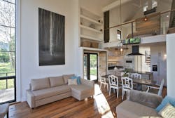
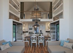
The goal, Turner says, was to squeeze as much as possible into 1,000 square feet. To enhance the feeling of spaciousness and to create drama and appeal, the main living area—comprising the kitchen, dining room, and family room—has a 26-foot ceiling. A porch that is 12 feet deep in the front and 10 feet deep on the sides wraps around the exterior of this space, offering views of rolling hills and woodland.
Double glass doors at opposite sides of the dining room allow cooling breezes to pass through in warm weather. “We use passive ventilation methods for the shoulder seasons, and it works great,” Turner says. The first floor also has a powder room and a flex room that serves as an office, den, and theater.
Two-story corner windows enhance the feeling of spaciousness and let light into the core of the house. Smaller windows in the tower also admit light and fresh air. “We have a lot of south-facing glazing,” Turner says, “so in the wintertime the house stays pretty warm without [turning on the heat].”
A space-saving spiral staircase leads to the tower, where the private areas are located: the master bedroom and secondary bedrooms for the children. The master bath has a freestanding tub, oversize shower, and dual vanities. There’s also a half-bath and a stacked washer and dryer in the tower.
Structural insulated panels (SIPs) made with magnesium oxide were prefabricated off site, delivered in flat packs similar to Ikea furniture, and used for the floors, walls, and roof. Magnesium-oxide (MgO) SIPs aren’t as widely used in the U.S. as they are overseas, but they offer many added benefits over traditional SIPs, according to Turner. “I think [this is] one of the first houses [in the U.S.] to use MgO SIPs,” he says. “MgO predates Portland cement; it’s the mortar that was used on the Great Wall of China. It’s a natural, more sustainable product than concrete, with high structural integrity.”
The home has a tankless water heater, and there’s a high- efficiency 50,000 Btu wood-burning fireplace in the family room. On cold nights, the fireplace heats the entire house. Combined with a ductless HVAC system, the SIPs offer a level of energy efficiency that Turner says is “pretty close to a geothermal system, without the cost. My electricity bill is in the $40 to $60 range per month for heating and cooling.”
Barn wood from an old Virginia smokehouse was used for the flooring and some of the walls. The reclaimed lumber was also used for countertops on the bathroom vanities, which were purchased at Ikea. The tower is wrapped in Cor-Ten steel.
The home even has what Turner calls “a poor man’s wine cellar.” Bottles are stored under the back porch, where two galvanized horse-watering troughs are buried in the ground and vented with high and low PVC pipes that naturally convect and circulate the air. Hatches in the floor on each side of the staircase provide access to the wine.
“It may not work as an everyday house for everybody, but it’s more than we need,” Turner says. “People seem to celebrate the landscape and each other better with a house like this.”(Photos: Jim West Phalen)
Micro Miracle
The Micro House lives large for 430 square feet—large enough for the homeowner to host contra dances: folk dances featuring long lines of couples.
In addition to being a contra-dance caller, the client is an artist who “wanted the house to respond particularly to the site and to his own needs,” says architect Elizabeth Herrmann. “He had a fixed budget and was more interested in sacrificing square feet than sacrificing design and quality of work.”
The 1.2-acre site has dramatic views of Camel’s Hump, one of the tallest peaks in Vermont’s Green Mountains. The client’s requirements included a kitchen, space for a dining/work table, a bathroom with a tub (no shower), a sleeping area, storage for clothes and household goods, a sleeping loft for his visiting daughter, and space that could double as guest quarters. To reduce clutter upstairs, there is a basement—accessed by a large hatch in the floor—for the washer and dryer, mechanical equipment, and additional storage.
Builder Chris North of Northern Timbers Construction, in Ripton, Vt., constructed the house with carved-out corners that Herrmann says “reduce unnecessary space and give a minimalist shape to each room.”
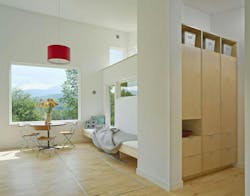
Herrmann utilized an open floor plan, sculpting the space so that the different areas of use have definition and a sense of place without being static or confining. “The ceiling is 14 feet, 4 inches at the peak and about 8 feet at the low end,” she says. “It’s comfortable and doesn’t feel at all claustrophobic—even for the client, who is over 6 feet tall.”
The lower end of the house contains the more intimate and private spaces such as the bathroom and sleeping area, whereas the living area and loft are at the higher end. “The spaces spill into one another and are very fluid,” Herrmann says. “Nothing but the dining room furniture is in the middle of the room, so the plan is airy and open. Because the layout isn’t square, parts of the plan are revealed only as you move through the house.”
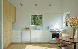
The main-floor storage space includes a tall birch cabinet in the kitchen, built-in storage next to the bathroom, hanging space for coats, roll-out storage under the bed, and various wall niches and drawers. The unfinished basement is as large as the house and is accessed by a trapdoor big enough to accommodate a kayak.
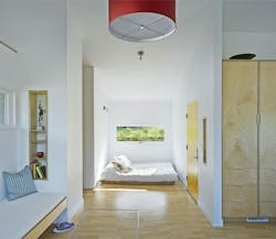
Herrmann set out to prove that the client didn’t have to live in a box. “[This house] tricks you into feeling that it’s bigger,” she says. “For instance, the wood [flooring] is very light [in color] and the planks are all short lengths. It has a watery effect that makes the house feel much larger.” To give the bathroom more privacy, Herrmann made sure it didn’t open directly onto the living spaces; instead, it’s approached through the built-in storage area.
The windows each have a shape and size that’s specific to desired views and the degree of openness or privacy: • One large window faces east toward Camel’s Hump. • Long windows above the custom-made sofa bed follow the ridgeline beyond
• The kitchen window defines the heart of the space and frames the entry so that the client can see guests arriving.
• The bedroom window is low and horizontal to offer more intimate views and ventilation.
• The bathroom window captures the view from the tub.
• The loft also has its own pair of windows that frame mountain views and open for ventilation.
