Some architects embrace the modernist label, while others try to avoid using the term to describe their work, preferring to talk about scale, proportion, and context. After all, does anyone really want descriptions of their work to be reduced to a single word?
“From my perspective, I try not to put labels on things,” says architect John Patrick Winberry, a founding partner at The Up Studio, in Long Island City, N.Y. “To your point, we are modern architects for sure, but with regard to projects, I really believe in the idea that we want our architecture to react to the site. And I don’t mean that so much aesthetically, but more that it’s performing at a high level in its sustainability goals and is also the unique solution that it’s trying to create for our clients.”
Architectural solutions should indeed be site-specific, contextual, and highly personalized to how clients live. Still, it’s plain to see—even to the untrained eye—that there is a marked contrast between Ludwig Mies van der Rohe’s Farnsworth House, in Plano, Ill., the Glessner House by architect H. H. Richardson, in Chicago, and the Rosecliff mansion, in Newport, R.I., by Stanford White.
But just because your architecture takes the form of a cube doesn’t mean it’s not high-performing or beautiful. As Custom Builder guest columnist, Duo Dickinson, writes: “‘Style’ is an outcome, not a motivation, and in architecture, outcomes are the tips of icebergs of effort.”
Modern by the Bay
Sag Harbor, N.Y., is a centuries-old former whaling village on the north side of the South Fork of Long Island. Once a sleepy little town, it now teems with rock stars, hipsters, day-trippers, and Wall Streeters. It is here that The Up Studio sought to create a modest little gem of a family home. This is the sixth project the firm has done for this client, so there was already great rapport and a high level of trust, Winberry says. As a result, the brief was simple: Design a clean and simple house.
Project: Harbor Hideaway, Sag Harbor, N.Y.
Architect: The Up Studio, Long Island City, N.Y.
Builder: LCL Construction, Sag Harbor, N.Y.
Size: 2,630 square feet
Site: 0.23 acre
Photos: Alan Tansey
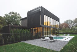
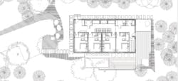
The Up Studio responded with a 2,630-square-foot single-family residence organized on two levels. Situated near the center of a small peninsula, the home’s corner site is one of the only lots in the neighborhood without direct water views.
Although the usual approach would be to design a new house to face the street, the architects deliberately flipped that traditional orientation so the home faces the rear corner of the yard instead. They also eliminated fenestration on the front corner of the house so the first-floor façade effectively screens the home from the street, while the rear is fully glazed on both levels with custom Marvin windows, opening up to create a powerful connection between the interiors and the surrounding lush landscape. The street-facing second floor is fully glazed with floor-to-ceiling windows that admit morning light into the bedrooms, while a rooftop deck provides far-reaching harbor views. “We’re really passionate about making logical decisions early on so everything we do on our houses has a ‘why’ behind it,” Winberry says. “Our argument to the client was, ‘We don’t want a pitched roof on here; we want to occupy that roof so we have water views.”
Eliminating windows and doors on the front façade’s first floor allowed the architects to create plenty of floor-to-ceiling storage, which wraps into the kitchen like one continuous element measuring almost 40 linear feet. “That gave this compact footprint significantly more storage than would typically be possible in a home of this size,” Winberry says.
The design makes extensive use of a traditional material, cedar, but it’s given a decidedly modern twist by being double-stained a dramatic black hue and installed vertically. A cedar shade trellis wraps the entire home to shade the south-facing bedrooms from the summer sun and ties in the carport, creating a covered entry.
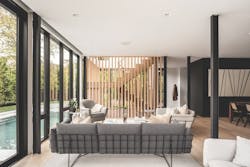
Inside, the home is bright and airy thanks to generous glazing facing the backyard and pool. A simple palette combines blond wood, white cabinets, and an exposed structural steel grid with just four interior walls, allowing light to reach far into the home. The “subtle sophistication” of the material and furnishing selections “allow the property’s surrounding natural elements to ... provide a pop of color,” the architects write in the project statement.
Yes, the house is modern, but the firm likes to think of it as contextual modern. Says Winberry: “We love the idea that we’re using a similar materials palette to the surrounding homes but then reappropriating those materials in a simple and clean manner.”
Rooms With a View
A couple passionate about gastronomy who are great lovers of Quebec’s Charlevoix region dreamed of someday owning a modern house in this spectacular natural setting. They wanted a pied-à-terre where they could while away their free time, as well as a vacation home where families, friends, and colleagues could gather. To execute their wishes, they hired Montreal-based firm Architecture49.
Project: Le Littoral, Quebec, Canada
Architect: Architecture49, Montreal
Builder: Habitat Econstruction, Baie-Saint-Paul, Quebec
Size: 2,400 square feet
Site: 1 acre
Photos: Stéphane Brügger
“Charlevoix is known for the majesty of its views: the St. Lawrence River meets the sea, the mountains of the Hautes-Gorges skirt fertile plains, under a sky that plays the role of a moving painting,” the architects say. “The region, its terroir, and the people who live there receive each season many visitors seduced by its authenticity.”
In this setting, Architecture49 designed a home—by deconstructing and reworking the silhouette of the region’s farm buildings—that blends into its environment. The house is “resolutely contemporary” but discreetly inserted into its surroundings.
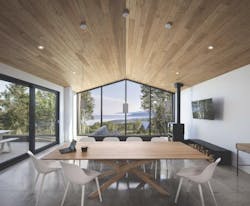
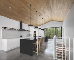
To make the home an ideal meeting place for the people who stay there, Architecture49 created a sleek, functional environment full of thoughtfully integrated facilities, such as a swimming pool, sauna, fireplace, and spa. “The kitchen, which occupies a major space upstairs, is equipped with a multitude of professional tools for amateur chefs and gastronomes, so that they can take full advantage of the high agricultural and culinary center that is Charlevoix,” the firm says in its project statement.
One of the most challenging aspects of the design, the architects say, was placing a decidedly contemporary house in a rustic environment: “A special effort was made to minimize the impact on the land, woodcutting, and landscaping, so as to envelop the residence in a natural setting while enhancing the majestic view toward the St. Lawrence River and La Malbaie Bay.” To accomplish this, the team built the structure high up. The building leans on the gentle slope and forgoes a basement in order to avoid extensive excavation. The general shapeI of the home’s plan follows that of the land and is laid out on a precise axis to offer a view of the river in front and privacy in the back. On this axis, the design team optimally positioned the building’s various volumes, openings, and interior rooms. “[The] layout minimizes energy consumption in both summer and winter, creating a cocoon that maximizes the intimacy of its occupants while offering the rooms the soft luminosity of a forest clearing,” the architects say.
Though modern in appearance, the home is organically integrated into its regional environment and includes the work of local artisans, as well as using a range of locally sourced materials, such as Quebec granite for the kitchen countertops and locally sourced metal sheets for the exterior cladding. Even the pool and the home automation system are produced by companies in Quebec that demonstrate the know-how and technology of the province. The building’s structure, which was assembled a few miles from the house, uses locally produced FSC-certified eastern white cedar and pine. Other building components include a contemporary sheet-metal roof and a high-efficiency, eco-friendly fireplace.
