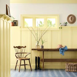
Leading paint brand Sherwin-Williams has yet to announce its annual color of the year, but its newly announced Colormix Forecast hints at the hottest hues for home design in 2025.
The forecast includes four palettes—Chrysalis, Paradox, Wellspring, and Kindred—that highlight the future of home trends, plus the overall ideas informing the design choices made by homeowners and designers. These ideas and trends include quiet luxury, joyful risk-taking, modern mindfulness, and building a better world for all, according to Sherwin-Williams.
“With the 2025 Colormix Forecast, we want to invite everyone to immerse themselves in the storytelling world of Capsules: an exploration of the magic contained within the colors, materials, and finishes that will inspire innovation, create connections, and illuminate the future of residential and commercial design,” said Sue Wadden, director of color marketing at Sherwin-Williams.
The brand’s Colormix Forecast features 48 different colors within the four palettes. As in the past, it’s likely one of these 48 shades will be named Sherwin-Williams’ color of the year.
The Colormix Forecast announcement also coincides with the debut of Sherwin-Williams’ color-focused podcast, Color Mixology.
Chrysalis
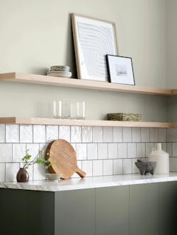
The Chrysalis palette focuses on peace, intentional living, and a transformative future thinking, explains Sherwin-Williams. These hues include earthy tones like sands, clays, and woods. Most notably, without a hint of blue.
“I want people to envision its natural elements, but it's interesting, this palette is very nature-based but has no blue in it,” says Emily Kantz, color marketing manager at Sherwin-Williams, on the Color Mixology podcast.
• Grounded SW 6089
• Sealskin SW 7675
• Mexican Sand SW 7519
• Pure White SW 7005
• Studio Clay SW 9172
• Studio Mauve SW 0062
• Carnelian SW 7680
• Shiitake SW 9173
• Thunderous SW 6201
• Mindful Gray SW 7016
• Drift of Mist SW 9166
• Tanbark SW 6061
Paradox
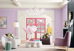
The Paradox palette highlights all things fun and dopamine-inducing, a shift noted in recent trend reports with fewer homeowners seeking white kitchens and more hoping for personalized spaces. Sherwin-Williams describes this palette as electric brights, grounding neutrals, and candy-coated accents.
• Egret White SW 7570
• Dragon Fruit SW 6855
• Talipot Palm SW 6726
• Inkwell SW 6992
• Slow Green SW 6456
• Alabaster SW 7008
• Antiquarian Brown SW 0045
• Frank Blue SW 6967
• Rejuvenate SW 6620
• Quilt Gold SW 6696
• Cascades SW 7623
• Euphoric Lilac SW 6835
Wellspring
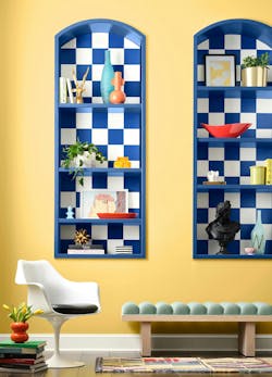
The Wellspring palette focuses on personal history, narratives, and heritage, explains the brand. It includes hues of blue and midtones.
• Warm Stone SW 7032
• Persimmon SW 6339
• Borscht SW 7578
• Bosc Pear SW 6390
• French Roast SW 6069
• Oyster White SW 7637
• Tres Naturale 9101
• Upward SW 6239
• Outerspace SW 6251
• Chartreuse SW 0073
• Green Bray SW 6481
• Gallery Green SW 0015
“So being inspired by those ancestral roots and then also in alignment with where those kind of design styles of the past and how those kind of blend and merge, and we're having this fresh interpretations of, like, Art deco and Art nouveau is popping up,” explains Kantz.
Kindred
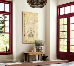
The final palette combines deep, rich shades with warm neutrals aimed to nurture and nourish.
“Kindred's really focused on the community. So what's inspiring you within your community?” says Kantz. “What is the key design factor with Kindred? And I think it's an evolution, and it's very up for interpretation. And I kind of like to think that it's pattern mixing and it's being inspired to what's in front of you.”
• Redend Point SW 9081
• Dark Night SW 6237
• Rookwood Red SW 2802
• Caribbean Coral SW 2854
• Koral Kicks SW 6610
• Storm Cloud SW 6249
• Icy Lemonade SW 1667
• Rockweed SW 2735
• Tidewater SW 6477
• Sun Bleached Ochre SW 9011
• Creamy SW 7012
• Red Tomato SW 6607
