Maximizing Light and Space: Innovative Infill Homes in Seattle
Story at a Glance
- Hybrid Architecture develops innovative infill homes that optimize natural light and airflow in dense urban environments.
- The firm uses inverted floor plans and rooftop decks to maximize space, light, and outdoor living in compact city sites.
- Design features include large windows, strategic placement of living spaces, and sustainable water management systems.
Access to fresh air and daylight in an urban environment can be particularly challenging. Building up is a simple answer.
Hybrid, a firm with four distinct but interconnected studios—design, build, develop, and space (a pop-up gallery)—aims to build affordable, sustainable living spaces in the Seattle market and differentiates its designs by focusing on details that make its homes unique.
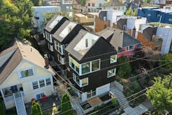
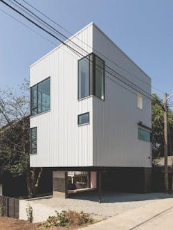
In a densely populated Seattle neighborhood, the firm developed two adjacent infill sites: The Lookout, a single-family home elevated above three parking spaces, and Shake Shacks, three cedar-clad townhomes.
Hybrid’s founding partner and design principal, Robert Humble, designs projects with an inverted floor plan to maximize air and light.
“Elements are stacked vertically to take advantage of the smaller footprint of tight urban sites,” says development manager Alex Herbig, who has worked with Humble for near three years.
The first floor typically has one or two bedrooms or flex rooms, with the main living space on the floor above. Then, above that, Hybrid incorporates a roof deck, essentially putting the backyard on the roof.
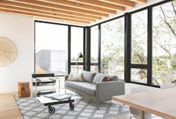
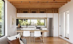
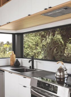
In The Lookout, a horizontal band of windows above a narrow kitchen backsplash helps amp up the amount of daylight and makes the space feel larger. Putting the kitchen and living space on the second floor “makes it feel as if residents are in a tree fort,” Herbig says.
The windows are standard double-pane vinyl and in the corner where two windows meet, a metal casing covers the framing.
Views were an important consideration in designing The Lookout. The kitchen’s long, linear window wraps the corner to provide a picture-perfect view of downtown Seattle (Photos: Rafael Soldi).
“We set this corner back, and the dimensions are two by four, so it’s a little shallower,” Herbig says, noting that the walls are 2 by 6. “It’s then capped in metal to match the windows and make it feel as if the windows are ganged together—which isn’t possible without structural steel framing.”
The outcome is a clean, modern aesthetic at a much lower cost.
The Lookout stands above three parking spaces.
The Shake Shacks’ rooftops go beyond functional. Often, rooftop decks are flat, “but in Seattle, while it can be a sunny day, you can’t be up on the roof deck for more than 10 minutes before you’re cooked—or it’s windy and cold,” Herbig says.
The Shake Shacks’ 12-foot-by-12-foot rooftop decks are open on one side and tuck into a vaulted area over the living room, allowing for privacy and shelter. Solar panels drape the other side of the roof.
In The Lookout, a horizontal band of windows above a narrow kitchen backsplash helps amp up the amount of daylight and makes the space feel larger. Putting the kitchen and living space on the second floor “makes it feel as if residents are in a tree fort.
As for rain, water makes its way along the sloped roof membrane and heads to a scupper box where it filters down the gutters to bio-retention wells along the building’s perimeter. The necessity of water collection and distribution on dense urban sites is often viewed as strictly utilitarian, but Hybrid sees water management as an opportunity to further elevate the building’s design.
Project Details
The Lookout and Shake Shacks, Seattle
Architect
Hybrid Architecture, Seattle
