Design
New Kids on the Block
Older, more affluent neighborhoods are desirable places to build custom homes. They offer a location, lifestyle, and cachet that can’t be found anywhere else. When an opportunity to build new does arise in such a neighborhood, it’s typically costly and the design review process can be onerous. But the process also can result in a sparkling new gem for the neighborhood’s crown.
The three custom homes profiled here added luster to an island in South Carolina, a popular Florida destination, and a historic Michigan neighborhood.
Downsizing in Winter Park
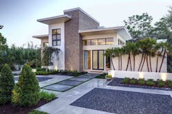
Architect/builder Phil Kean describes the style of this home in Winter Park, Fla., as “warm modern.” Natural materials such as wood and stone keep the contemporary residence from feeling cold. Photos: Michael Lowry Photography
Winter Park, Fla., began in the late 19th century as a winter playground for industrialists who built lakefront mansions and small cottages. Today, its waterfront lots fetch millions of dollars.
Winter Park-based architect/contractor Phil Kean was charged with designing and building a new home for empty nesters who wished to downsize. “[The clients] raised their family in a big, traditional home in Winter Park, moved to Boston for a couple of years, and then moved back to Winter Park. They wanted to build something contemporary, much smaller, and very green.”
Kean used transom windows to enhance the flow of natural light into the home, minimizing the need for artificial light during the day.
The couple bought a 100-by-121-foot lot in a neighborhood called the Vias, typified by historic mansions, large new homes, and mid-century modern ranches. An existing home on the property dating back to the 1950s was demolished. “It was about 1,100 square feet and not very well-built,” Kean says.
Despite limitations imposed on height and square footage by the city’s design criteria and its proximity to setbacks, Kean’s 3,200-square-foot design fulfilled all of the couple’s requirements. “He wanted modern and she wanted traditional, so they compromised on a modern home with warm materials,” he says.
The custom kitchen cabinets are made from slabs of high-gloss acrylic. The flooring is vein-cut limestone tile, and the countertops are natural stone.
Scale-wise, the home falls somewhere in the middle between mansion and cottage, Kean says. “[The clients] probably could have put a 5,000-square-foot home on the lot, but they wanted only spaces that they would use,” he adds.
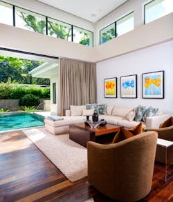
On the main level is the master suite, kitchen, family room, dining room, a piano nook, and an office with a Murphy bed. The centralized family room offers a view of the pool via floor-to-ceiling windows. Upstairs are two guest bedroom suites and a loft the clients use as an exercise room. Eventually the loft will double as a sleeping area for grandchildren, Kean says.
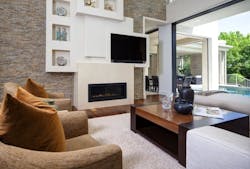
A unique wall sculpture in the family room holds a gas fireplace, a television, and personal mementos. Quartz ledgestone covers the walls. Sliding glass doors open completely to the pool and lanai.
But the focus of the home is the indoor/outdoor living area, which has a dining area and a sitting area with an outdoor fireplace. Kean brought the pool up into the courtyard so that when the clients are sitting on the lanai, they’re surrounded on two sides by water. “It’s sort of a U-shaped design that gives them a lot of privacy when they’re outside,” he says. “You almost feel like you’re on an island.” Kean capitalized on the sloping lot by raising the pool deck 3-feet off the ground.
The pool wraps around the lanai’s dining and sitting areas to give the homeowners privacy. Motorized screens can be lowered when necessary.
Natural stone was used inside and out to create the desired warmth and an abundance of glass floods the interior with natural light.
The LEED Platinum home features an airtight thermal shell; a high-efficiency HVAC system; LED lighting; energy-efficient windows; low-flow faucets; dual-flush toilets; low-VOC and formaldehyde-free materials; and rooftop solar panels.
(CLICK NEXT AT BOTTOM OF PAGE FOR NEXT HOME)
[PAGEBREAK]
Classic Town, Classy Foursquare
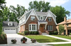
The roof line looks complicated, but was actually quite simple to build, says architect Wayne Visbeen. “Those 20/12 gables on the front are false,” he says. “They are literally on the face of the brick and make the simple two-story box look much more interesting.” Photos: Courtesy Visbeen Architects
Some of the homes in East Grand Rapids, Mich., are around a century old. “It’s a classic town in the same vein as Winnetka and Hinsdale, Ill., and one of the nicer, more affluent neighborhoods in western Michigan, with a mix of Georgian, Arts & Crafts, Tudor, and Shingle-style homes,” says architect Wayne Visbeen, president of Visbeen Architects in Grand Rapids, Mich. Local furniture manufacturers such as Baker and Widdicomb established a tradition of fine craftsmanship that is reflected in the older homes.
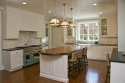
The East Grand Rapids home’s kitchen countertops are granite, with a walnut countertop on the island. The flooring is white oak.
Visbeen’s clients, a young couple, wanted a new home on what he calls a typical infill lot: 75 feet wide by 145 feet deep. “They wanted a kitchen open to the family room, a separate dining room, and a den on the first floor. Upstairs they wanted four bedrooms, a laundry room, a Jack-and-Jill bath, and a nice master suite.” All of this had to fit in approximately 3,000 square feet.
Visbeen drew a floor plan that topped out at 2,840 square feet. “We basically did a Foursquare that lives large and functions really well but is very controlled in square footage.”
The master bathroom has a claw-footed tub, pedestal sinks, marble flooring, and tile wainscoting, which builder Dave Morren says is unique. These features give the room a 1920s-period feel.
The home’s simple shape and central staircase uses space efficiently. From the foyer, visitors can see straight through the home to the backyard. There’s also a lower level that the clients plan to finish at a later date.
Front-loaded garages are discouraged in East Grand Rapids, and the lot was too narrow for a side-loaded garage, so Visbeen opted for a more traditional detached garage behind the home: “We prefer to do garages further back so that the house is the star.”
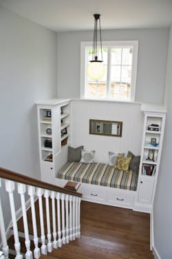
Window seats and built-ins increase the functionality and appeal of the stair landings. On the first floor, the windows have the added benefit of drawing natural light into the lower level.
The exterior blends well with its surroundings, with a traditional façade that combines brick, shakes, and wood trim. Details such as the copper accents on the bay window, the antique-looking lanterns, the arch-top door, and the swooping brick walls flanking the front steps are appropriate for the early 20th century neighborhood.
Builder Dave Morren of Insignia Homes, Kentwood, Mich., says, “Between Wayne, the clients, and ourselves, we did a good job of fitting the exterior elevation into the existing neighborhood and making it look as if it’s been there for a while.”
(CLICK NEXT AT BOTTOM OF PAGE FOR NEXT HOME)
[PAGEBREAK]
Grounded in History
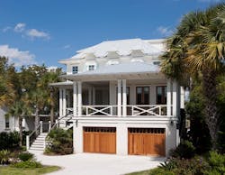
This home on Sullivan’s Island, S.C., has three elevated floors that maximize available space on a limited building footprint. The metal roof and other exterior materials were selected for their resistance to water and salt air. Photos: Dickson Dunlap
Sullivan’s Island, S.C., has a long military history of protecting Charleston Harbor from invaders. Today, the island’s laid-back lifestyle makes it a mecca for tourists and would-be residents. In addition to its beaches and waterways, Sullivan’s Island boasts a top-notch restaurant district and is just 20 minutes away from downtown Charleston.
Five Guidelines for Custom Infill Projects- Make sure the new home is in scale with the existing homes around it.- Get the neighbors on board with what you're planning to build.- Pay attention to easements, setbacks, and local design guidelines.- If the home is in a flood zone, you must comply with FEMA and any local or regional regulations.- Work out the logistics of site and equipment access early on so problems don't arise with excavation and soil removal.
Inevitably, the island’s popularity pushed land prices sky high. When residential overbuilding became a concern, the town set up historic districts and implemented strict regulations governing new construction.
Architect Steve Herlong, who is based on Sullivan’s Island, is well-schooled in FEMA flood-zone regulations and local ordinances that dictate the size, height, and appearance of new homes. He designed the home shown here for a couple with four children on a relatively small site (58 feet wide by 160 feet deep) that narrows as it gets closer to the water.
“We knew we were going to need the approval of the neighbors prior to even going to the [town design] review board,” Herlong says. To compensate for the restricted building footprint, he designed a three-story structure, elevated on pilings 8-feet above grade; reduced its height and mass on the street side; and put porches and single-story space directly facing the street. The roof lines get taller away from the street.
The home also had to be compatible with what the review board perceived as island architecture. “So we just sort of played with that idea,” he says. “The layout is very contemporary and functional, but stylistically it’s coastal, with wider roof overhangs, an extensive use of porches and more traditional use of materials such as lap siding and trim.”
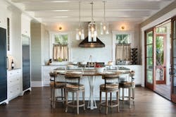
The kitchen has an island eating bar and doors that open to a large porch embracing the water view. Wide-plank, hand-scraped oak floors and other durable finishes stand up to wear and tear from the coastal climate as well as the antics of four teenagers.
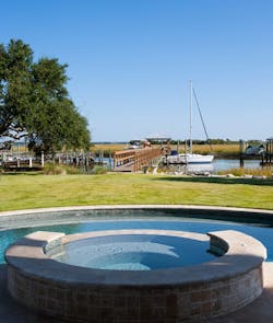
The home has a total of 3,744 square feet, not including a portion of the ground level that is equipped with an outdoor kitchen, swimming pool, and spa. Builder Michael Daly of Daly & Sawyer Construction, Mt. Pleasant, S.C., recalls some of the difficulties he encountered: “It was a long, thin lot and the house sits in the marsh. We had to attach the in-ground pool to pilings. While we were digging it, water would come in with the tide. We had to pump it the whole time.”
Homes in hurricane zones also require more complicated strapping and tie-downs. Daly & Sawyer had to attach the roof continuously to the foundation. “For this house, we drove pilings below grade until they hit stable soil, and then put a masonry foundation on top of the pilings,” Daly says.
Two of the children share this bedroom, which has a bathroom en suite with an industrial-style, double sink. The deep crown molding and vaulted, paneled ceiling evoke the island’s historic cottages.
The clients wanted a master suite facing the water view, three additional bedrooms for the children, and a guest suite. To maximize available space, Herlong designed a combination guest suite and playroom on the first floor and put the other bedrooms on the second floor. Two of the children share a bedroom. “We couldn’t have long or linear hallways because that was just eating up square footage. Plus, I had to squeeze in a staircase, an elevator, and a laundry chute.”
In this home, the view is always the focus, and it’s the first thing visitors see when they enter the foyer. The kitchen and living room extend to the outdoors via a spacious back porch.
The pool and spa are great places to enjoy views of the marsh and waterways. Due to the high water table, the in-ground pool had to be attached to pilings.
Cottage-style details such as wood paneling on the walls are juxtaposed with spaces such as the kitchen, which is decidedly contemporary. As Herlong puts it, “The house has contemporary features housed in a traditional envelope.”
